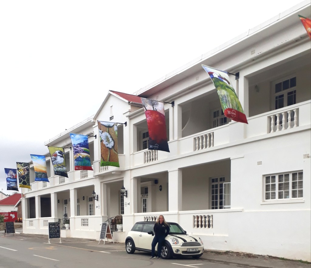
BIG NEWS! My Art is Flying High on Flags Surrounding the Karoo Art Hotel

I got a call from Rick Melvill (of Melvill and Moon), co-owner with Sue Melvill (of Unplugged) of the Karoo Art Hotel in Barrydale, to ask if I would like to be the next artist to showcase their art on flags that will be flanking the hotel. Well, I was absolutely thrilled by the idea and obviously answered with a resounding, “Yes!”

They asked me to come up with 12 Karoo-themed designs to go on the 12 flagpoles. The project, from start to finish, took around 5 months to complete, with the creative team at the hotel meticulously choosing the designs and which printer would make this project truly come to life.

Well, two weeks ago they went up! And we were all just over-the-moon with the impact it made in brightening up Van Riebeek Street. Thank you so much, Rick and Sue, for your Barrydale-beautifying vision and for giving me the opportunity to be a part of this project.

You can see a collage of the flags below:

Rick asked me to come down to the hotel on the morning the flags went up, to do a short video about how the flags were designed and some of the work that went into creating them.

You can view that here:

Video credit: Rick Melvill.

Gavin Huart (below), the manager at the Karoo Art Hotel, called me to come and unbox the flags with him. What an exciting treat that was! It felt like Christmas had come early.

We took 12 short videos of each flag as they were being unveiled (I will release those videos soon – so don’t forget to follow this blog).

Gavin was instrumental in getting these flag images logo-ready, colour-coordinated, and into production. He also found himself running around town, trying to source a sewing machine to get some last minute work done to the flags on the day they went up, and doing all the said sewing work himself! A man of many talents. Thank you for all you hard work, Gavin.

And thank you to the Barrydale resident who lent the hotel her sewing machine.

The artwork on the flags was taken from segments of my paintings which I’ll go into in my next blog, so again, stay tuned and thanks for coming on my flag journey with me.

If you are in the Barrydale area, why not pop in at the hotel and view the flags yourself? They offer exquisite artsy accommodation if you fancy resting your head overnight (or longer), excellent fine dining, a bakery that serves the best scones and coffee I’ve had to date, a gorgeous private garden with pool area, and a bar for the wary traveler (bar menu also available). Visit them at www.karooarthotel.co.za. And, again, thank you to all the staff at the hotel for making this vision a reality! You are so appreciated.

You can purchase prints of these flags HERE.

See each individual flag HERE: https://cherieroedirksen.com/2023/09/04/the-12-individual-flags-hanging-at-the-karoo-art-hotel/

What Exactly Does a $3,000 Arty Puzzle Look Like?

I’m so happy to announce that The Waterford Puzzle Company have selected 4 of my artworks to add to their custom puzzle collection.

They range from $325 – $3,000, which may seem a bit on the high-end but they boast bespoke wooden pieces that include shapes, like animals or your name, within the puzzle (see details below).

Such fun!

Which is your favourite one of the 4 below? I’d love to hear from you.

Get yours here or click on the picture below:

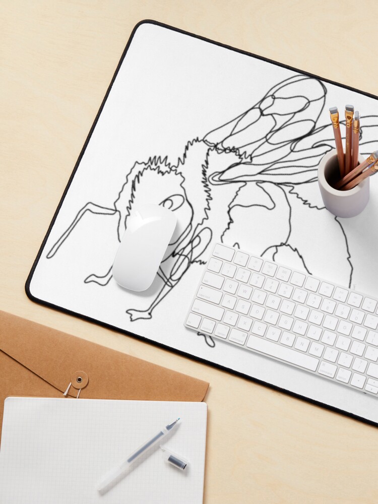
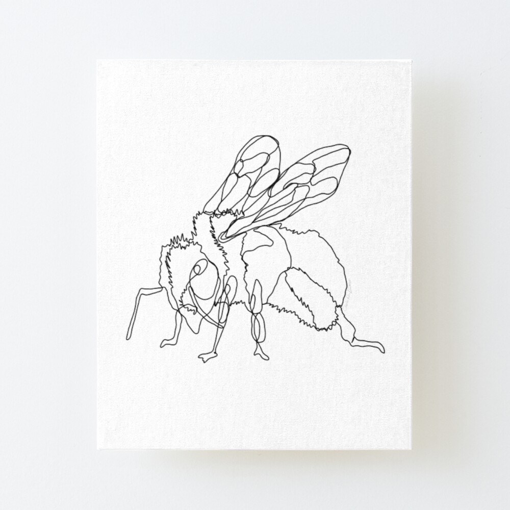
Drawing a Bee With a Single Line

I finally decided to try my hand out at single line drawing. For those of you who don’t know the technique, it’s simply drawing something without lifting your pen/pencil.

For my subject matter I chose a bee ’cause my garden is swarming with them at the moment and it felt appropriate as we head into spring in South Africa.

So without further ado, here’s my first ever single line drawing called “Beeline.”

“Beeline” by Cherie Roe Dirksen

I’d love to know what you think, please leave a comment 🙂

Have you ever tried your hand at single line drawing? Why don’t you send me a link in the comment section? I’d love to see!

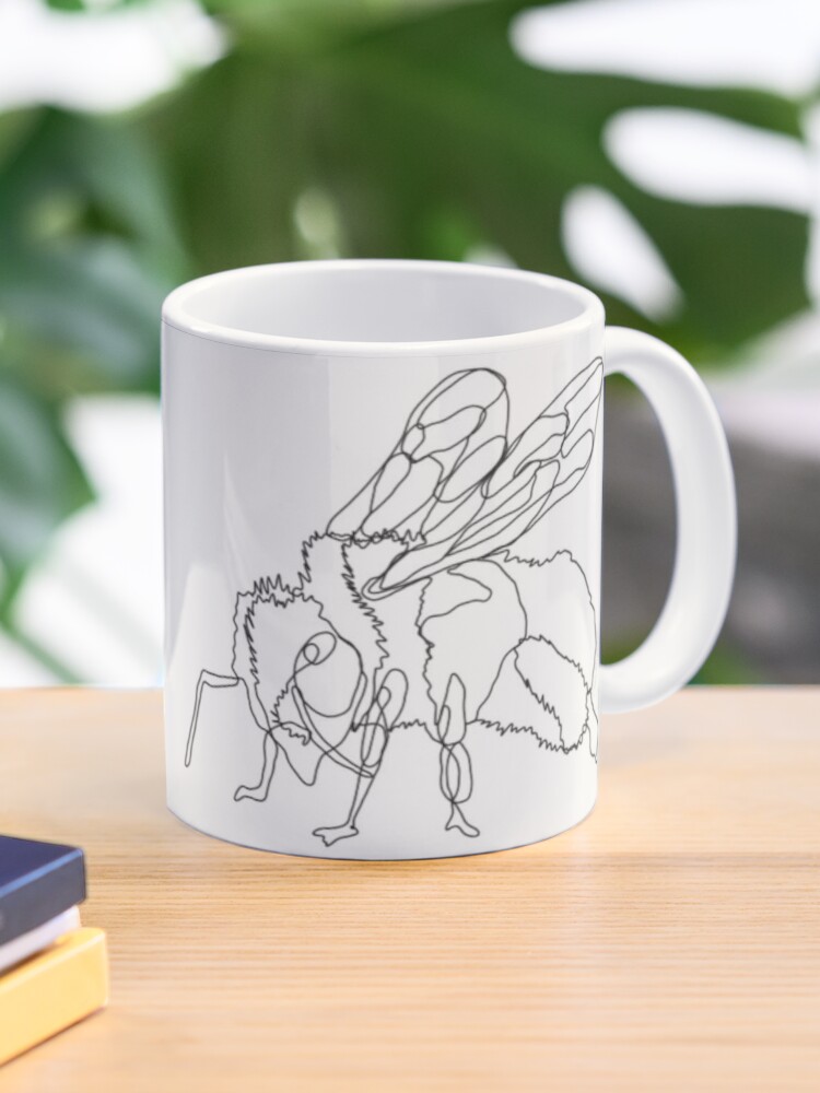
I’ve got a selection of products featuring this design, I’ve selected a few below to whet your appetite. Just click on the picture to take you to the store:

Thanks for looking!

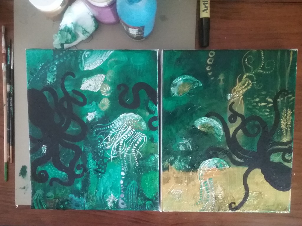
Start-to-Finish Photo’s: Painting Abstract Underwater Scenes

I haven’t painted for a while as I’ve been concentrating more on my graphic design work. But a couple of weeks ago I felt the creative bug bite me in the derrier, I just had to get my hands dirty.

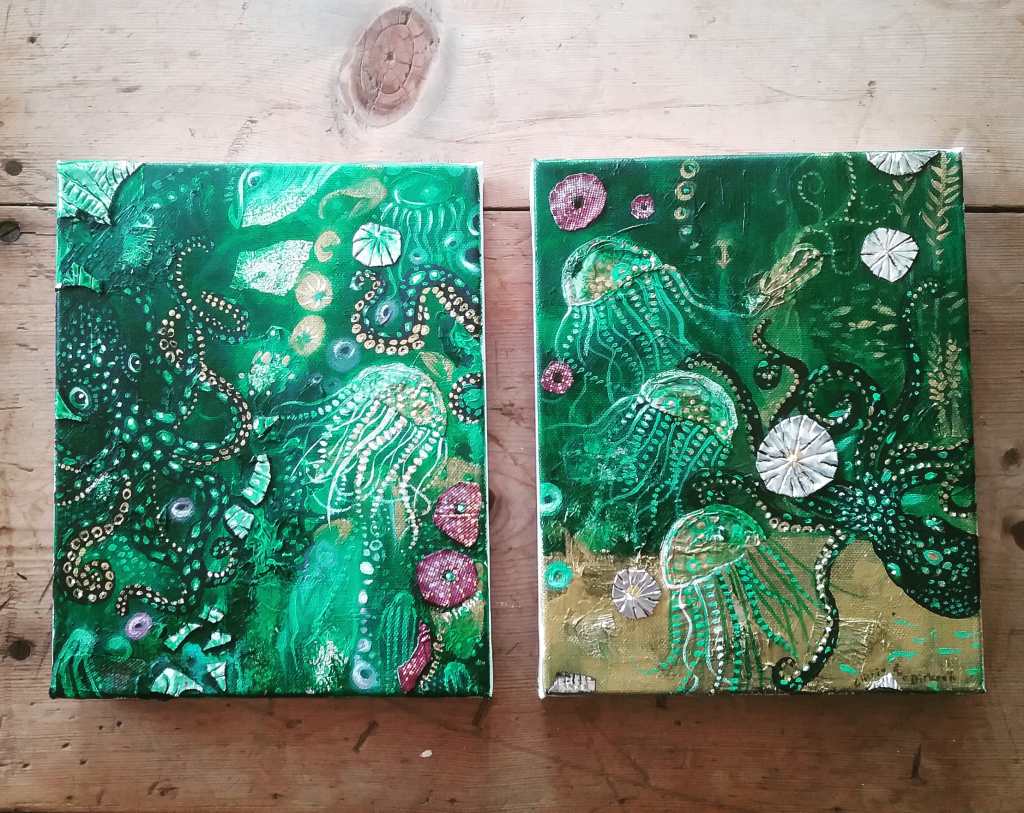
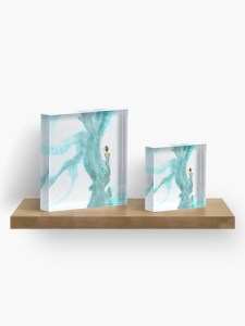
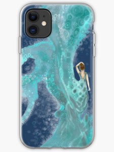
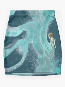
I recently watched My Octopus Teacher (I highly recommend it if you haven’t seen it yet). It was filmed just around the corner from where I grew up. The spectacular cinematography got me all inspired. So without much ado, let me show you the photographic process of my double painting duo, “Tentacle Soiree“:

I had a really great time experimenting with the different metals and foils I used in these pieces. The finished paintings are below and available to purchase – just click on the picture below or HERE.

Thanks for coming with me on this octopuses garden journey!

Other blogs you may enjoy:

Art Process: The Making of ‘Sister Africa’

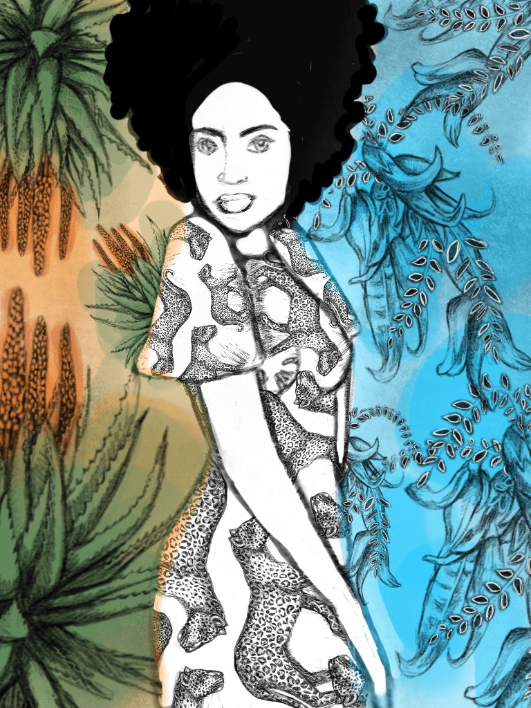
Here is a start to finish process of my latest illustration, ‘Sister Africa’ – a tribute to the beauty of the people, flora and fauna of South Africa.

And the finished product:

You can get all sorts of prints and products of this artwork by clicking HERE or on the picture above.


Going Digital with Flare

Featured

I’ve been really getting into drawing on my tablet recently. It’s great fun and a good way to be productive away from the confines of an office, studio or sitting behind a computer. I get creative sitting out in the garden or while I’m hanging ten with a cup of tea.

But is it cheating?

The Artist Debates

A lot of people in the artistic community feel that digital painting/drawing is basically cheating.

Well, yes and no.

I don’t think anything can replace the energy, vibrancy and feel of original art painted with real, genuine paint! But I do, as an acrylic and mixed media artist, feel a certain freedom on the tablet.

For one, there’s no mess. No mixing of paint or scrambling to find that sharpener for your blunt 3B pencil. I absolutely love that perk! But I also like the zoom and extensive texture features. You can experiment and really take details to new dizzying heights.

In saying that, I will never stop physically painting. I sometimes like the grotty side of it and getting to smeer paint onto canvas with my bare hands and play with metals and different materials.

However, digital painting is a great tool and can get you to explore and discover new techniques and avenues without expense or time constraints.

The Water Nymph

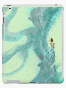
This  is my latest digital artwork, all drawn by hand, called, “The Water Nymph“(right).

Pop in at my online shop to see, “The Water Nymph“, on lots of cool and beguiling products – click HERE. I have listed a few of the product designs below too. Let me know what you think 😉

Good to Know

Did you know that RedBubble is a print on demand shop where products are made one at a time reducing over-production? They are carbon neutral, have safe working conditions and a small footprint. There are 70+ high-quality products that are made in the most responsible ways possible. Plus you are supporting a global community of artists.

Makes you feel all warm and fuzzy, right?

Crafty Kids: Making Robots Out of Tin Cans and Recycling

Featured


I run the craft class in my local youth upliftment center (it’s called ‘Net vir Pret‘ which is Afrikaans for ‘Just for Fun‘). We mainly use recycled material (aka household trash) for our projects.

I’ve had so much interest with people visiting the class that I decided to share what we do with the world. I get a kick out of these classes and what’s possible to make out of waste, I hope it inspires you to do the same and it’s a great project to do with the kids during school vacations.

There’s nothing more important, in my mind, than a child who is encouraged to use their imagination and creative expression. And to couple that with using rubbish to produce fun and quirky creations, well, that’s just a bonus!

Don’t forget to pin it!

So, in today’s blog, we made robots. Here’s what you’ll need:

  1. A glue gun.
  2. Cans (we used beer/soda cans for the arms and legs and tuna cans for the feet and head).
  3. A 2l water bottle for the body. Hint: use an eco-brick as it gives it more weight and you recycle more rubbish! Find out what an eco-brick is and how to make an eco-brick in my article: Eco Bricks Just Might Help Save the Planet and YOU Can Start Yours Today!
  4. Acrylic craft paint and brushes. You have to use acrylic paint or spray-paint for it to stick to the bottle and to last. OPTIONAL: use an acrylic varnish for sealing and protecting once you’ve finished painting.
  5. Bottle caps, plastic spoons, etc (for accessories, eyes, ears, etc). The sky and your imagination are the limit here!

To begin, take your glue gun and make the structure of the body by gluing the arms, legs, feet, head and any other accessories you want to use.

Paint.

It’s as simple as that and your kids are going to love it!

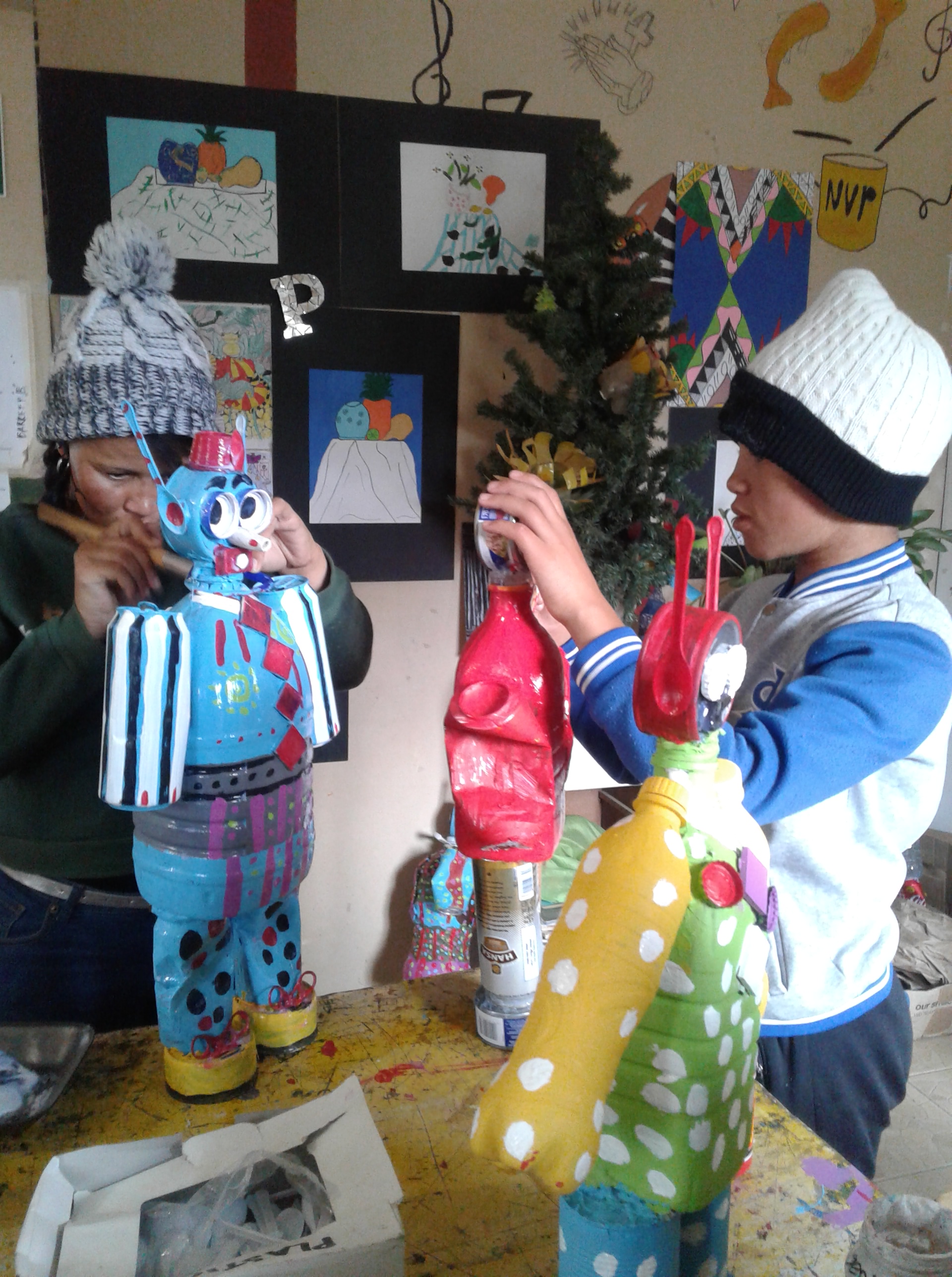
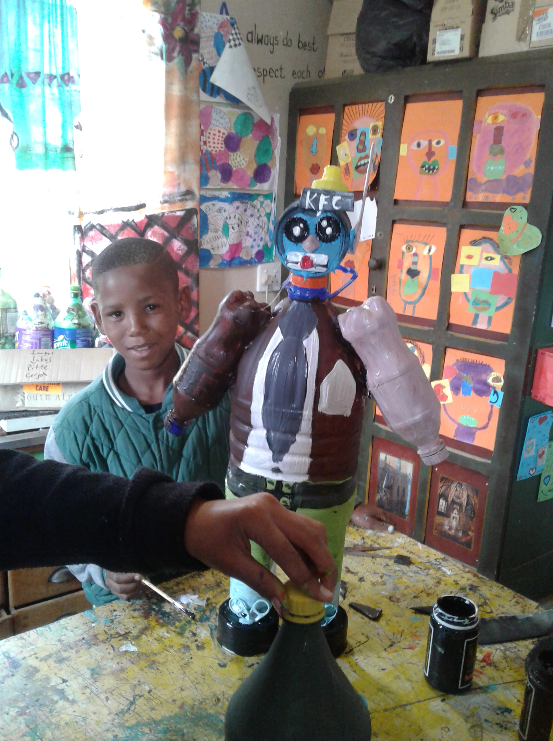
Here are some photo’s of my students in action (to find out more about Net vir Pret click here) 🙂

Other articles you may enjoy:

Make Money Creating Beautiful Recycled Goodies Today!

10 Peculiar Pigments That’ll Turn Your Stomach!

9 Great Reasons for Getting Creative (No Artistic Experience Needed)


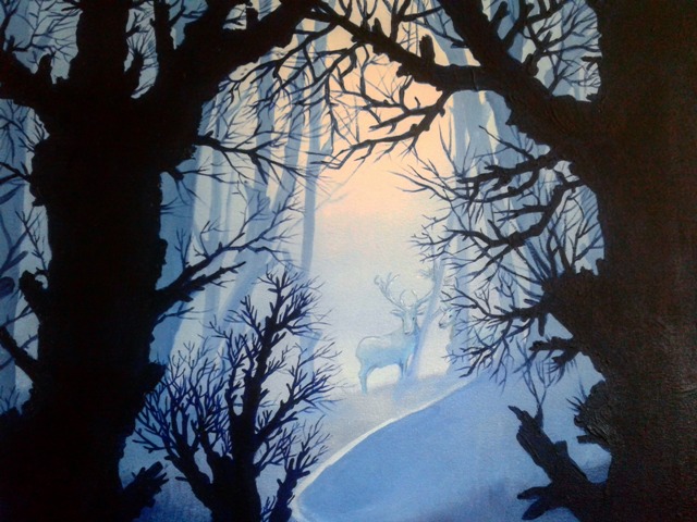
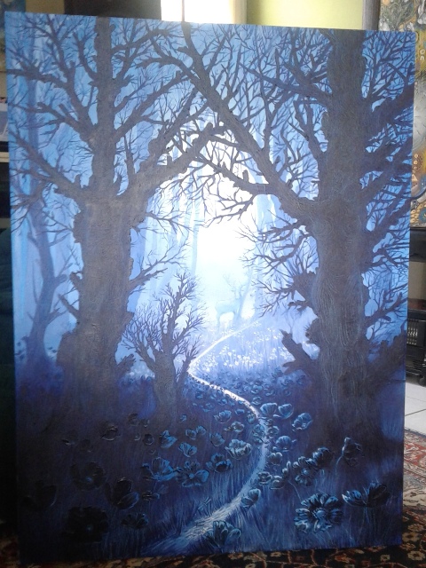
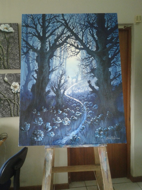
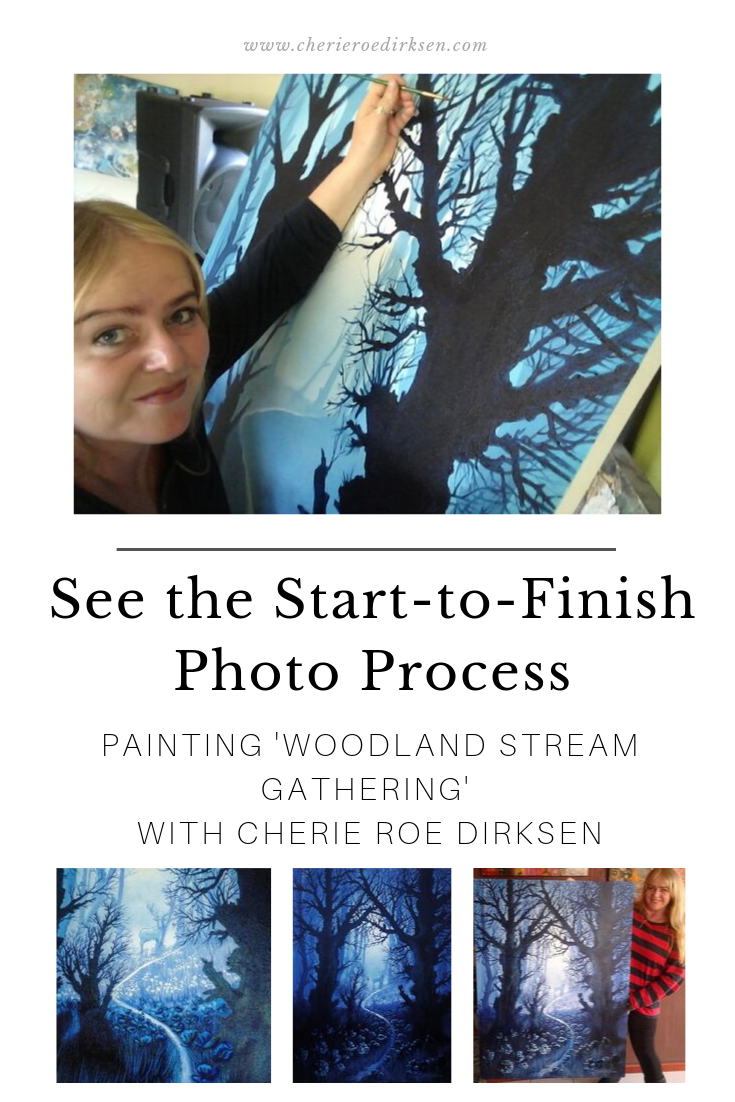
Going Large: The Start-to-Finish Photo’s of Painting ‘Woodland Stream Gathering’

Featured

Living the Dream

It has always been a dream of mine to paint BIG. Although I have painted a few large scale paintings during the course of my career, I am now sold on the experience of painting big.

It’s really going to be my prime focus now as it was such an enjoyable (albeit daunting) project.

This painting was all about fantasy, magic, mystery and letting the imagination run riot.

Without further ado, here is the photo process of making ‘Woodland Stream Gathering’:

This was the start of the first layer.

The background trees now make an appearance — layer 1 of 3 layers of trees.

The second and third layer of trees is established. Now it’s time for detailed branches!

It’s hard work and my arm felt like lead weight.

Then came the stags (one is hiding behind the tree) — can you see it?

Now comes the details in the background and foreground (flowers and grass)

And lastly, the figures of the man, woman and child need to be brought out…

Here I am with the painting to show the size:


These were the photo’s I took during the painting process. Please see below for the finished ‘professional’ shots for more details 🙂 As you will see, the colour varies quite a bit according to time of day. In the photo’s below, the colour is more true to the original.

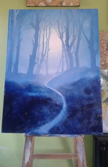
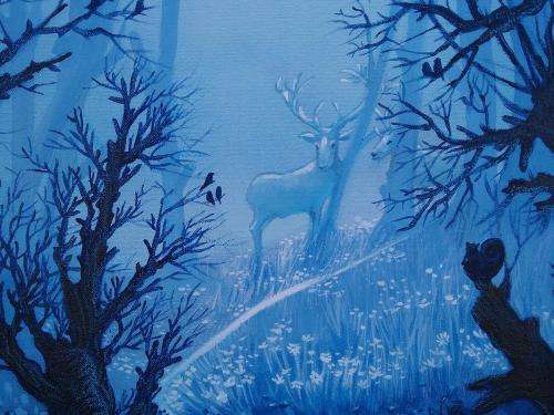
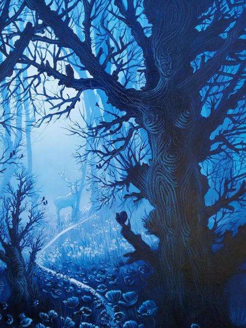
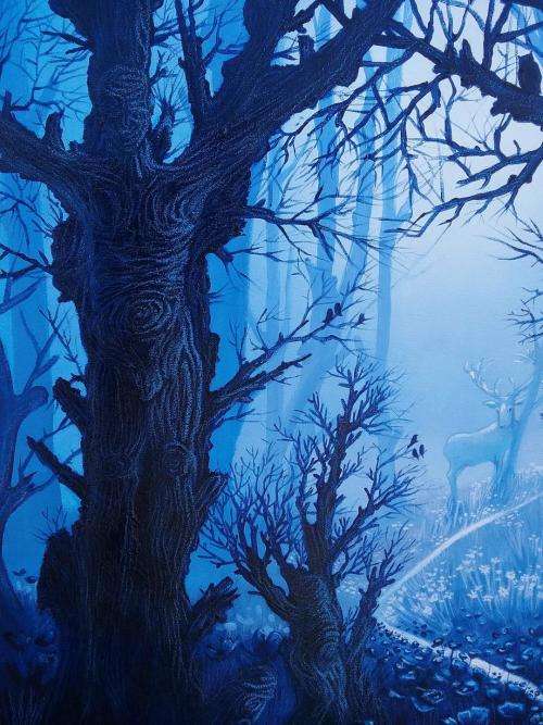
“Woodland Stream Gathering” by Cherie Roe Dirksen Acrylic on Canvas 120cm x 90cm

The original is for sale HERE

You can get prints of all sorts and products like blankets, bags, mugs, etc HERE

Don’t forget to pin it!

Below is the Poetic Description of the piece:

Deep in the heart of the forest,
an interconnected trinity is anchored
as mother, father and child.
Reminding us of our connection to nature
and to each other.
The roots reach out underground,
forming an unbreakable lattice.
The branches reach upward,
towards the heavens
touching the sky and the moon itself.
The watering stream is where life is drawn,
from stag to dragonfly.
dipping in and out of the life-giving vein.
Ever flowing, moving and alive with vitality.
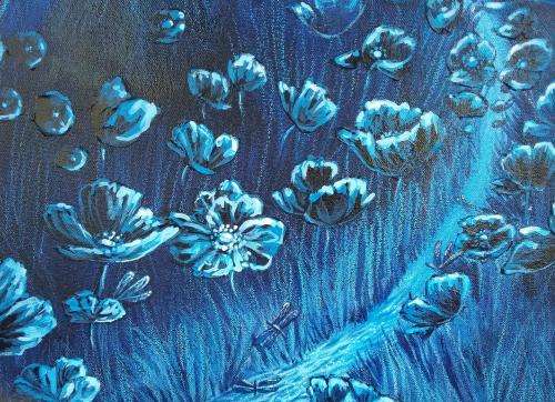
Poppies dance in the moonlight,
and hint at the fragile beauty
of the mysteries the natural realm emits.
Cloaked yet waiting for willing eyes to see.

Here are some close up details of the painting:

Get this great throw blanket with the art on it now at RedBubble!

Thanks for looking! I hope you enjoyed the painting process journey with me.

Other art blogs you may enjoy:


The Pastel Poppy Process (and Some Cracking Illiteration!)

Featured

Don’t forget to pin it!

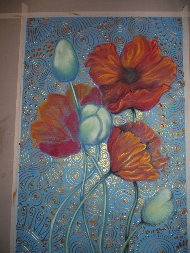
I haven’t done a ‘fly on the wall’ blog for ages, so I thought I’d show you the creative process behind my pastel poppy artwork called, Orange Poppies on Blue’. Yeah, I know…really original title. Named so because:

  1. the poppies are orange and,
  2. it’s been done on blue Canson pastel paper.

Where do I come up with these tantalizing, cryptic names?! lol…

It’s really interesting to see how the flower literally blooms on the paper, so without further blurb, here are the start-to-finish photo’s of my creative process.

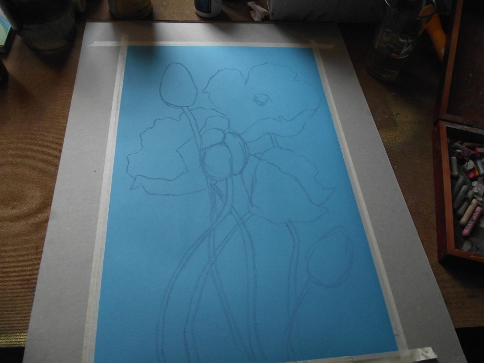
The first step is always about planning and mapping it out…

Outline of the poppies in pencil.

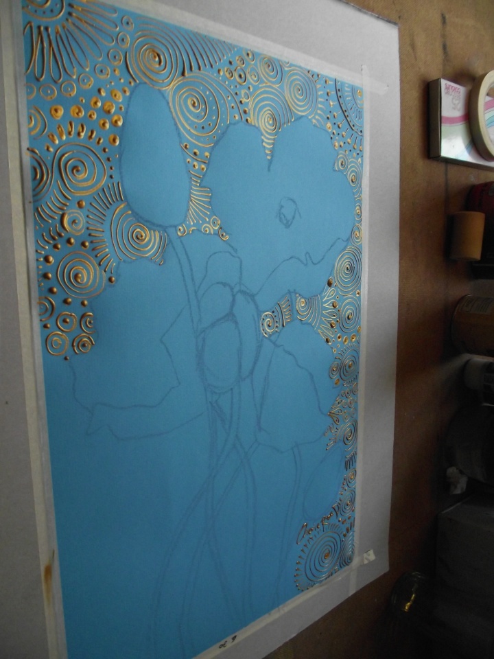
Start filling in the gold swirly spiral patterns.

Laborious work.

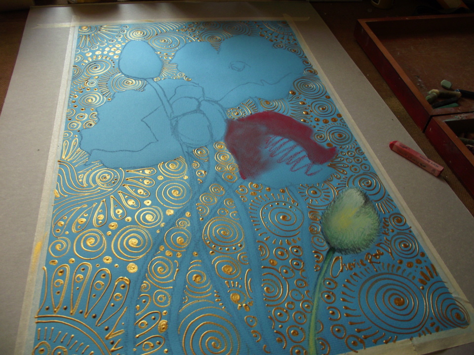
Very laborious work…

Now it’s time to get to work on the poppies…

Blending…

Adding details… (clearly I had to do something at 6:30? But what was it…)

Almost there…

Maybe I had to finish it by 6:30?

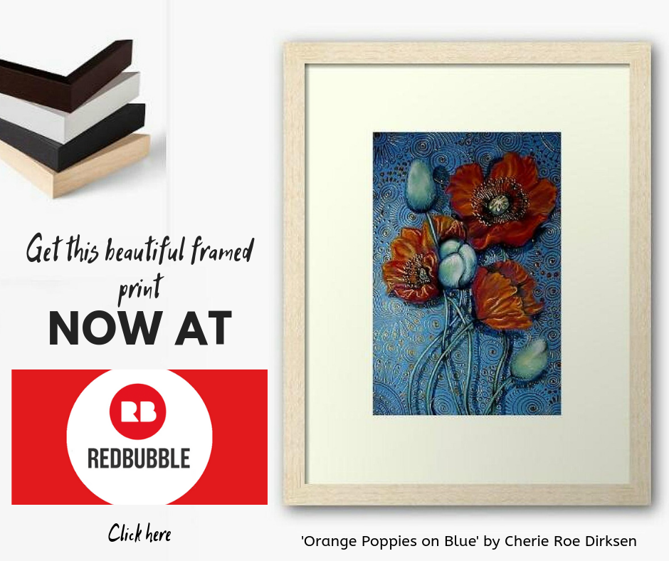
And, finally, the artwork is done!

This piece was recently featured in the grand opening exhibition of Heart Space Studio. The original is part of my private collection but I do have lovely, high quality prints for you. Please click on the picture below to take you to the framed prints (beneath is a link to canvas prints and photographic prints if that’s more your thing).

Here’s the link to the canvas prints: ORANGE POPPIES ON BLUE CANVAS PRINTS (starting at $62)

Here’s the link to the photographic prints: ORANGE POPPIES ON BLUE PHOTOGRAPHIC PRINTS (starting at $12)

Thanks for looking!

Other blogs you may enjoy:

       why nothing matters

An Accidental Triptych

Featured

Update: All 3 paintings below are now sold and with an art collector in Cape Town, South Africa. 

A Phoenix, Some Crocs and the Djinn

I was experimenting with a few of my original paintings and put these three together – I think they look rather spiff altogether as a triptych, what do you think?

These are from my 42 Exhibition (you can download the FREE booklet of art and poems here) which explored the meaning of life.

Click HERE to view the 42 Exhibition collection. Prints available too!

Screenshot_2019-03-26-18-34-33-1

Other articles you may enjoy:

The Art of Pastel Poppies — Come See the Photo Process

How To Branch Out — Painting Scenes With Trees

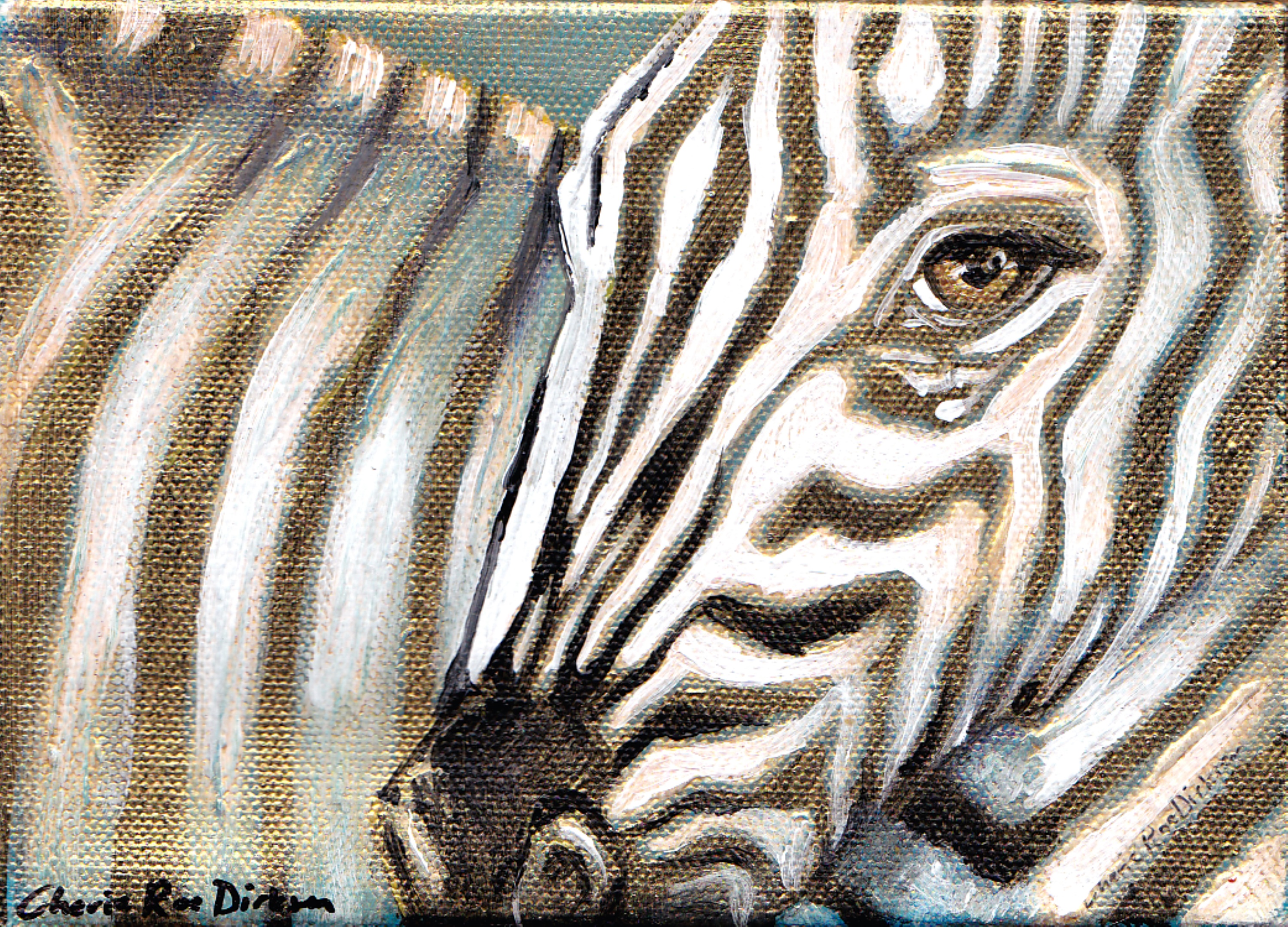
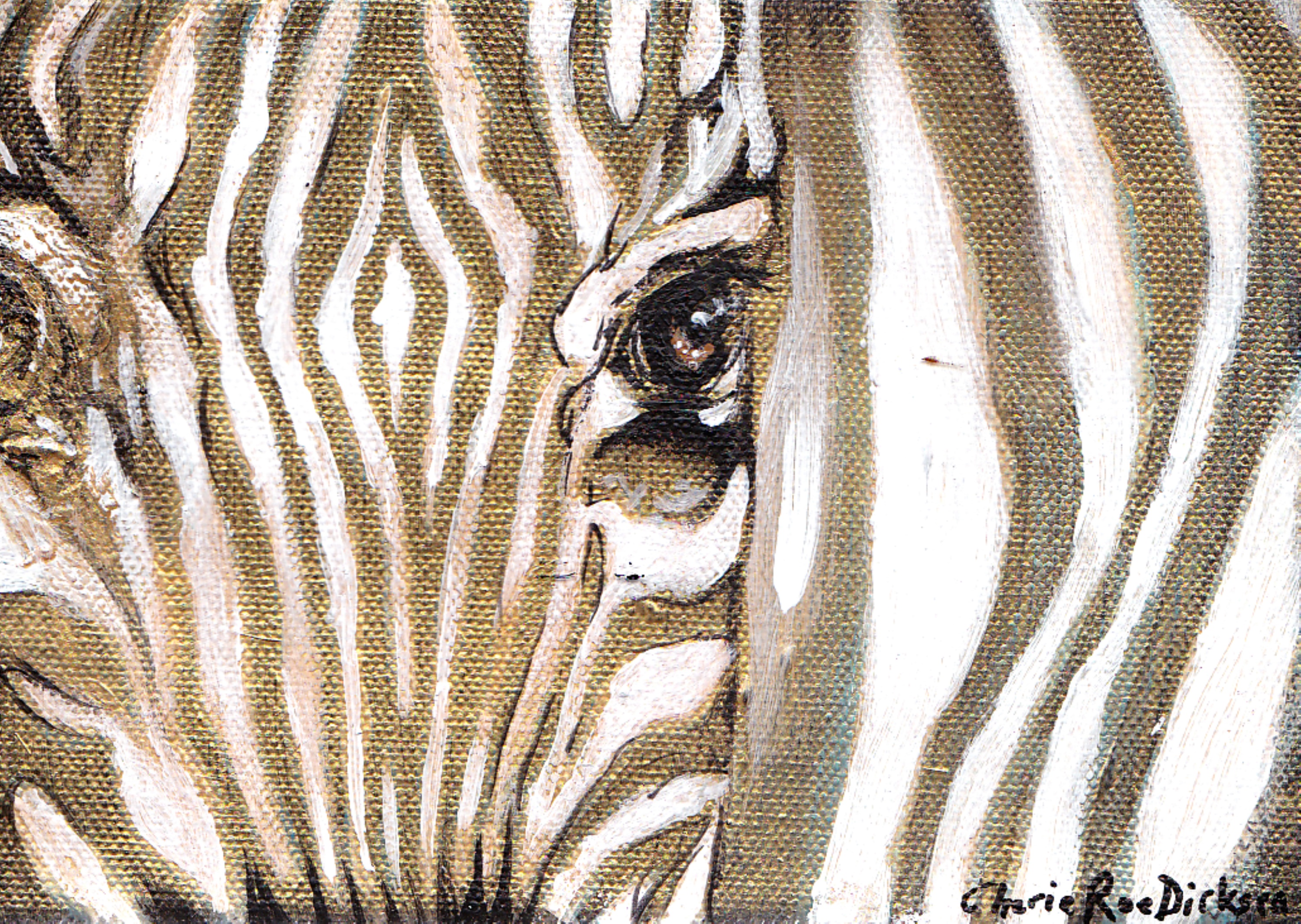
Zebra Art with a Gold Zing!

2 x zebras

I’ve been experimenting in the studio with my favourite colour a

t the moment — gold.

I can’t stop myself from adding highlights, splashes and just general copious amounts of gold to my paintings.

I have finished 2 little zebra paintings with these gold overtones and just love how they’ve come out. I can’t seem to catch it on camera, but when the light hits these little pieces they change completely. It’s almost like the hit another dimension…very abstract darling, with a hint of magic 🙂

The originals are SOLD.


Gold Zebra 1

Gold Zebra 2

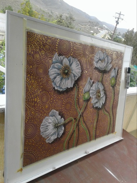
The Art of Pastel Poppies — Come See the Photo Process

It’s been a while since I did an art blog and it’s been an even longer while since I did one of my pastel poppy drawings (it’s actually been years! I’ve been mostly painting in acrylic these days).

I missed using pastels so I decided to do a BIG poppy artwork and photograph the process so you can glimpse it taking shape.

Here are the photo’s (it took me close to 2 months to finish — I certainly took my time! lol):

Stage 1: It begins…flowers are laid out first, then I fill in the background pattern

stage-1.jpg

Stage 2: More poppies are added to the mix

Stage 2

Stage 3: The background is completed and detail has been added to the poppies. I was working outdoors for more light (you can see the famous R62 in the background 😉

stage-3.jpg

Stage 4: It’s finished (and so am I! lol…)

Artist with White Poppies lr

For all you art enthusiasts who simply must have the original — you’re in luck! It’s still available through Saatchiclick HERE or click on picture below (you’ll also find excellent quality prints at Saatchi to suit your pocket and needs).

For those on a tighter budget — no worries — you can get high quality prints (or perhaps you fancy a cushion cover or iPhone skin?) by clicking HERE. An extra large photographic print is under $46!!! There are lots of print options available as well as products and clothing with this design on — there’s nothing more fabulous than wearing the art you love! ❤

Stage 6 Finished

Subscribe buttonThanks for coming on this artsy journey with me!

Other articles you may enjoy:

Quirky New Designs: Putting Pets to Good Use

Panspermia and Art: An Interesting Combination

Switching From Random Creating to Intentional Creating

Can Using Yellow in Art Enhance Your Mood?

Lemon Twist

dripping yellow paint

I’m going to start bringing out some art blogs with colour themes.  I know I’ve done this in the past but this time I’m going to have a twist.

The catch with this is looking at art from a zesty new perspective with regard to colour and emotion.

A Spiritually Colourful Palette

As most of you probably know, different colours have different significant meanings.  Not only are they used as metaphors — i.e. I’m feeling blue or he was green with envy — but we can also glean meaning from colours with respect to our auric system.

For more about aura’s, please visit this extremely useful site:  reiki-for-holistic-health.com 

They Call me Mellow Yellow

Here is an extract from the above-mentioned site on the meaning for yellow:

YELLOW AURA COLOR MEANING: Relates to the spleen and life energy. It is the color of awakening, inspiration, intelligence and action shared, creative, playful, optimistic, easy-going.

Light or pale yellow: Emerging psychic and spiritual awareness; optimism and hopefulness; positive excitement about new ideas.

Bright lemon-yellow: Struggling to maintain power and control in a personal or business relationship; fear of losing control, prestige, respect, and/or power.

Clear gold metallic, shiny and bright: Spiritual energy and power activated and awakened; an inspired person.

Very interesting.  Now with that in mind, I’ve scrubbed through some of my art with a predominantly yellow theme.  Let’s take a fresh new look with those eyes that bare a greater insight now:

Yellow Skies, Lonely Tree

White Poppies

Golden Sunset Sailing

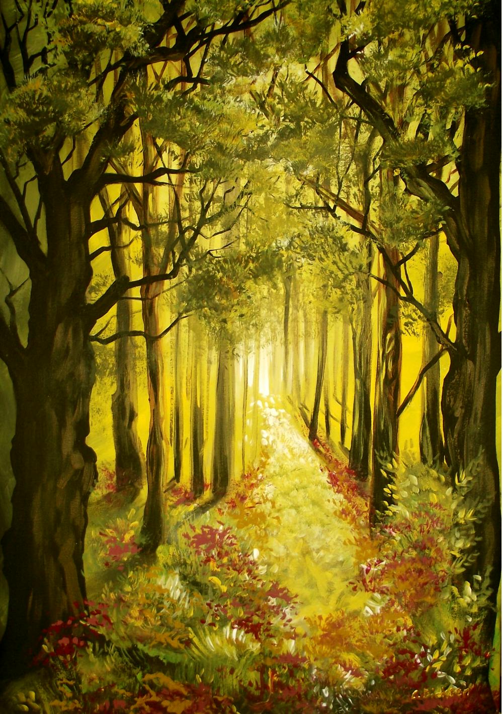
Path in the Forest

Yellow Sunset Triptych

Sunset in the Bushveld

Did any of these paintings make you feel any of the emotions from the above definitions for yellow? Or did it leave you cold?  Do you believe that colours can evoke certain feelings?

Please feel free to share your experiences and insights.

Other art blogs you may enjoy:

What Nature Can Teach Us About Art

Confessions of a Tree-Hugger

Painting a Zebra From Scratch

Something Blue…

10 Bands, 10 Paintings…Let the Rock Art Begin!

Coming Out of a Black Hole and Having Revelations

Yeah, the global energy of late has been intense.  Making us all bunker down for some quiet time, and if not, forcing you to cease and desist.

Have you been lacking inspiration, creativity or get up and go?  Well, I have.

Hatshepsut TempleThese last few weeks since I returned from Egypt have been damn right frustrating.  I’ve lost my pluck, mojo and anything else you want to call it.

I’ve picked up the paintbrushes and seem to be trying to repeat old patterns in creativity that just don’t work for me anymore.

“It could be realism, abstract, impressionism, crapism or bullshitism…who knows?  We’ll just have to wait and see.”

But this weekend I had a revelation…

Who The Hell Am I?

Yes, that old humdinger.  What can I truly offer the world that is unique and not only that,  stay completely in alignment with who I am?

Not easy and a question I am not alone in having to come up with an answer to — this seems to be the common thread or million dollar question among most people this year, if not this lifetime!

I Am…

I sat down to have some quiet time to reflect and saw a storyboard of everything I have done since I left school.  I know that I am intrinsically an artist, musician and a writer and I have tried to merge the 3 in this website but something still hasn’t clicked into place. In a nutshell, it went like this:The Bends

Above (Photo of our band The Bends taken in 2001)
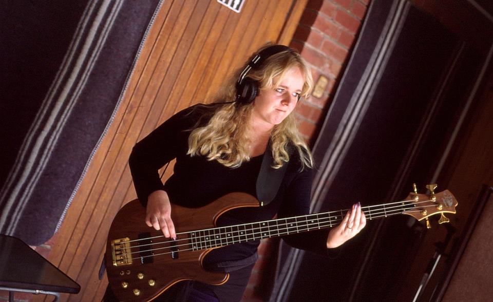
Cherie playing BassThe Younger Years — Left school and played bass in 2 rock bands.  Last band (The Bends — you guessed it, we were all Radiohead fans…yeah yeah) recorded 2 albums and got some radio play.  After the music scene cooled off and my weariness set in I up and left for the UK.  Photo (right) — in Paris Studio recording our 2nd album.

Travel Bug — In the UK I started painting again.  Got back home, 3 years later, and started painting full-time.
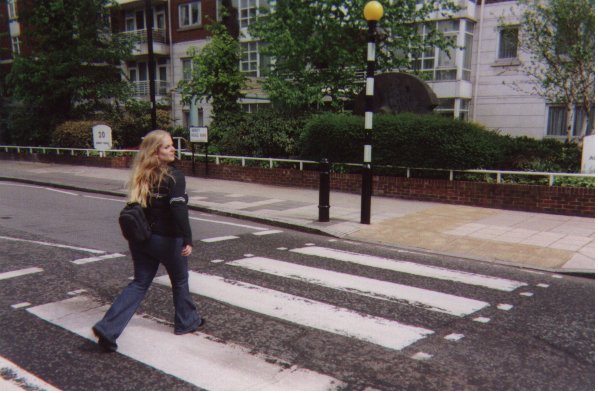
Crossing Abbey Road London

Above — In the UK, at the famous ‘Abbey Road’ crossing, London

Profile PictureDivine Revelations and Ants in my Pants — Started feeling ‘pushed’ to write my book ‘Divine You’ in 2010 and did so, focusing all my energy and attention into getting it published and promoting and blogging, etc.

Footnote — Here I am, having come full circle with all 3 of my major interests but I feel like I need to break free from the confines of every single one of them.  I need to fuse them into a trinity of talents that will truly showcase the uniqueness of my being.

New Realizations:

I am a rock chick, a philosopher, a creative, a free spirit, a wanderer, a listener, an adventurer, a seeker, a trailblazer…so what am I trailblazing?

” I am more than the ceiling limit I have built over my head.”

I feel like at the moment I am trying to conform to the standards of any other self-empowerment writer (who just happens to paint and compose on the side).  No, this is not working for me.  I am more than the ceiling limit I have built over my head.

Major Refurbishing

I am going to be blowing through the ceiling.

My first adventure, that incorporates all 3 of my pursuits, will be to do a series of 10 paintings to my favourite bands or musicians from the dawn of my time here on Earth.
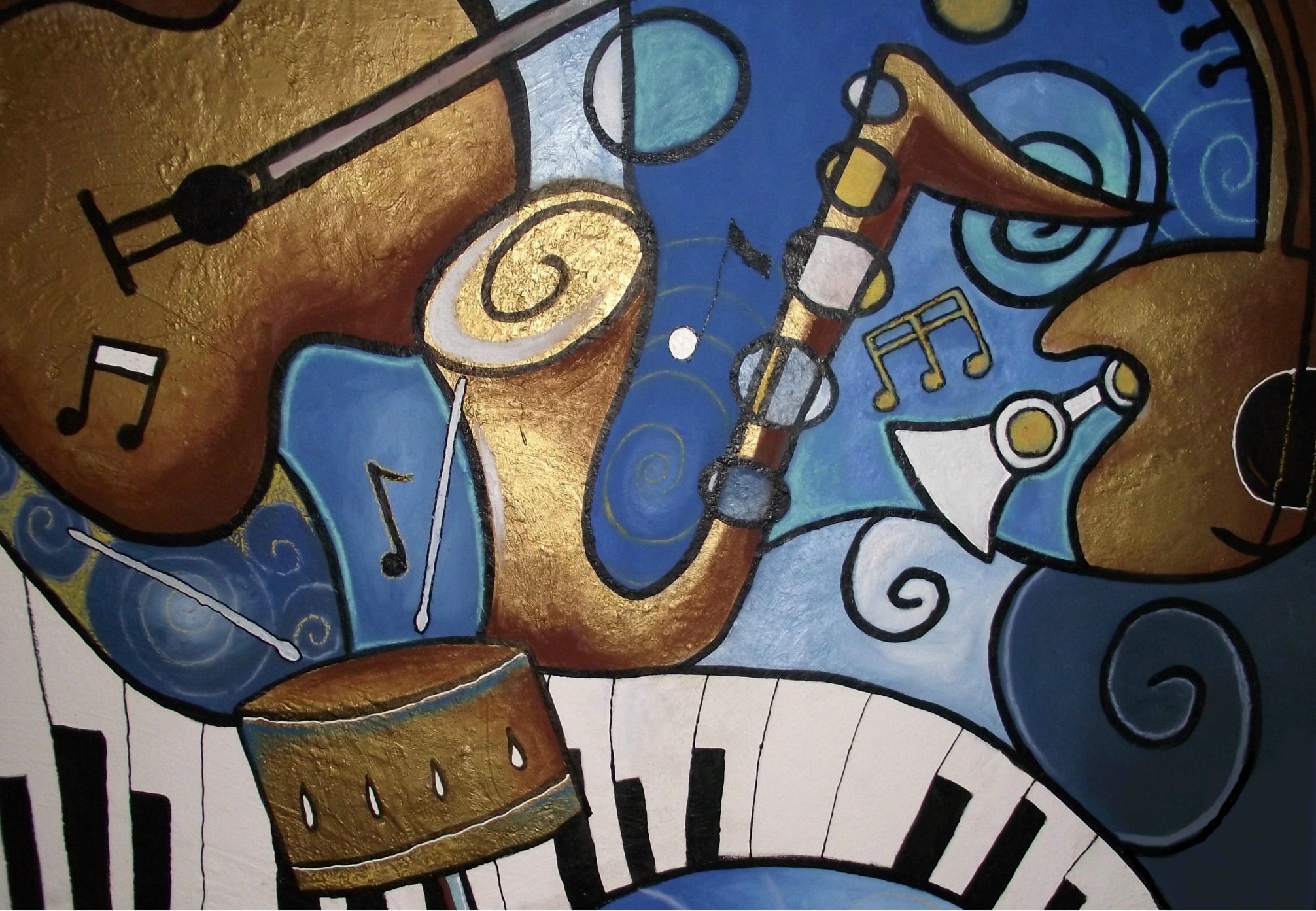
Musical Mural A little background:  I love to turn on the stereo in the morning and blast out my favourite music much to my husbands annoyance.  It just happens to usually be quite loud and obnoxious music for this time of the morning.  However the upside is that this ensures that the car gets washed, or that the lawn is mown (husband seeking refuge outside of the domain).

“I want to be activated into action first thing in the morning — and this plus a cup of coffee seems to do the trick.”

There is nothing like a bit of Airbag by Radiohead to get the blood flowing after a long nights sleep or head-banging your way to the bathroom to get cleaned up to Hysteria by Muse.  Who can’t be put into a good mood when you are listening to Queen’s I Want to Break Free?  Or even better, David Bowie belting out ‘Drive in Saturday’?

Yes, I know, I am a bit odd.  This is probably not the best morning music soiree (I am told this is strictly night-time music) but I simply can’t wait for night-time to arrive, I want to be activated into action first thing in the morning — and this plus a cup of coffee seems to do the trick.

So Where is This Heading?  Get On With It, Girl!

Okay, okay…I love rock.  Yes, oh yes.  So I have selected 10 bands to do 10 painting to.  I want to see what comes out whilst listening to their music.  I hope this experiment will be a visual feast and have no preconceived ideas of how any of it will turn out.  All I can guarantee is that I am going to have fun in the process and do whatever comes to me in the moment that I set aside to paint.

It could be realism, abstract, impressionism, crapism or bullshitism…who knows?  We’ll just have to wait and see.

I will be blogging (obviously) about each artwork and the process (so watch out for Tuesdays art blog).  And will reveal the top 10 bands/musicians that have been the greatest influence in my life in next Tuesdays blog.

So in the words of the famous Monty Python…”and now for something completely different”.  Bring it on!

READ THE GRAND BAND REVEAL HERE

Note to self:  Need to add new word invented in this blog to Wikipedia — ‘crapism’.  Needs no definition either, self-explanatory. Bullshitism seems to be a valid word because my spell check didn’t pick it up.

Share Your Insights:

What are you struggling with?

Do you have yourself all sussed out or are you still in flux about who you really are?

Do you think it is important to align yourself with your core essence or do you think that is just a bunch of crap?
Got It — Inner Art Expressed!

Please recap on last weeks article HERE.

I left off with saying that I still felt something was wrong.  An inner imbalance, something was crying out!

What Could Possibly Be Amiss?
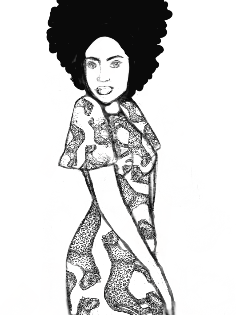
I sat on my couch looking at my painting, still feeling that something was out of alignment.  Do I still have to dig even deeper?
“If you don’t try, you’ll never know…”

A voice seemed to be asking me questions in my head.

Higher Guidance from my Higher Self (HS)?

HS:  What are you feeling?

Me:  Constricted.

HS:  Why?

Me:  I want to paint bigger.

HS:  A-ha!  You’ve been wanting to do that for the past 2 years now.  What is stopping you?

Me:  Big canvas is expensive and it means more paint and materials — I also want to experiment with different materials and it is all costly.

HS:  If you don’t try, you’ll never know.  Take the expense risk just for one week and see how it goes.

Me:  OK.

Stepping Out of the Box

It dawned on me how I put myself in a box.  I subconsciously and consciously limit myself by talking myself out of something for whatever reason.  And usually, they are not good reasons.

“You’ve got nothing to lose except living with regret for not trying.”

If you don’t try, you’ll never know.  So try and at least you can say you have taken that step.  If you succeed — great!  If you don’t, well then just see it as feedback.  You’ve got nothing to lose except living with regret for not trying.

So with that in mind, I came up with this:

I have called it ‘The God Code after the revelations that Gregg Braden has discovered that we possess a code in our DNA that literally translates, in Hebrew, to ‘God Eternal, in the body’.

I also had an epiphany to use all 4 senses whilst painting, I mean why not?!?  Before I started I got the distinct message that I was going to paint something that was healing and enlightening to the observer.  So I wanted to incorporate smell, touch, spirit and sound (I left taste out, for obvious reasons — unless you want a tongue full of chemicals!).

So this painting has been infused with:

  1. Rosemary and Lavender (I instinctively chose these two out of my garden.  When I later looked up the properties, you guessed it, lavender is for healing and Rosemary is for remembering — which you could say would be ‘enlightening’).  I made a tea out of it and used it in my brush water.  I also lit myrrh incense which is apparently good for tranquility.
  2. Prayer for the observer to obtain healing and enlightenment through the art/visual resonance (trying to emulate Dr. Masaru Emoto‘s fine work with water and the effects that positive words and emotions has on it).
  3. Bach.  I played my Bach CD on repeat until I was finished with the painting.  So it is infused with sacred, cosmic sound.
  4. Different textures.  I used a great granulated paint that is awesome to touch.  I also used a glass liner to add some raised pattern effects.

Let me know what you think?  What comes up for you when you look at this painting?  Come on, let me have it — the good and the bad.

Going Deeper…Inner Art Expression

Please read last weeks art blog HERE to recap on this interesting new artistic expression I have discovered in me.

Boring…

This week I started off doing my usual weekly art schedule.  Painting pretty pictures (you know, the ones that ‘sell’) and when I got to the end of the day this one popped out.

It truly took me by surprise as I didn’t know I had it in me.

What Sparked It?

I was listening to a talk on Project Camelot by Compton Rom Bada from ascendedhealth.com (do check it out — quite remarkable!).  In a nutshell, it was about how our body is made out of 90% microbes and while I was listening and painting — what I thought was going to be a cosmos painting — started automatically painting what looks like the ‘inner body’.  The microcosm cosmos.

Let it Flow

I love how my hand was just running over the canvas and splashing and doing all sorts of ‘things’ that I don’t normally do.  I just went with the flow and enjoyed the process.

Quite interestingly, the painting only took me about half an hour to complete.  I usually take about 2-3 hours for this size.  So there we have the law of least effort in place and working.

I sat on the couch after this episode and looked at the painting.  I liked it — it was different and different is good for me now.  Something was still wrong though…

The Missing Link by Cherie Roe Dirksen

I will let you know in next weeks art blog the epiphany I had!  And, hopefully, will have some tangible evidence thereof….

The Versatile Blogger Award

I was so delighted to open up my mail the other day to find this message:

“Dear Cherie, I have been following your blog for several months and find your posts always filled with meaning. They always make me think beyond my usual thoughts and bring me new and inspiring ideas. Your blog is created with love and honesty, and is extremely well-written! For this reason, I am nominating you for the Versatile Blogger Award!”

Thank you so much to the blogger of lOveOutlOud for the nomination.  Here is a beautiful quote from the Love Out Loud blog ‘About Me’ section that, I think, encapsulates the wonderful message that is being put across through this inspiring site:

“…Love is the most important thing on earth, yet we rarely mention it, we often forget to show it and a lot of us never listen to it. Some don’t even believe in it at all! Love makes the world go round; it’s an invisible force that brings us our best moments in life.”

It is a blog full of heart and soul, a positively inspiring and uplifting read! Don’t forget to check it out HERE.

After accepting the Versatile Blogger Award, the winner must:

1) Thank the person who gave the award and link back to them in your post.
2) Share 7 things about yourself.
3) Pass this award along to 15 blogs.

Right, now to divulge these 7 tasty things about me…here it goes:

1.  I love to hula hoop (yes, the ‘inner child’ will out!).

2.  Back in the late 90’s early 00’s I was the bass guitarist in a band called ‘The Bends’. I guess it will go without saying, that one of my favourite bands is Radiohead (our band was named after their second album).

3.  My first book took 5 months to write (Divine You — Redefining Love in the New Earth).  I started it In June 2010 and finished it in November 2010.

4.  I have a double jointed pinky (small finger) and love to whip it out at parties to freak people out.

5.  I grew up watching Star Wars and I love Science Fiction.

6.  My parents wanted a boy so badly after having 3 girls, that they pre-named me Jason.  Of course, they had the decency to rename me Cherie when I was born.

7.  I married my school sweetheart and never looked back!  :).

Right, now that I have aired out my not-too-dirty linen to the world, I feel a lot lighter.

I would like to nominate the following blogs/sites, in no particular order, that I find interesting, informative, creative, inspiring, entertaining, uplifting, helpful or just innovative.

Watts Up With That? — “The world’s most viewed site on global warming and climate change”

Daily Good “News that inspires”

Templeton — “Ambient Rock”

Peas and Cougars “If real life were a cartoon, I would be a triangle, which is probably better than being a square.”

RiseEarth — “Only together we can make a difference”

Sam Adams Photography

Life Lift“The Oprah blog”

2012 The Awakening

Ellis Vidler’s Unpredictable Muse“Thoughts on writing, grammar, the moon, andfriends–whatever comes up.”

The Extinction Protocol: 2012 and beyond“2012 and Earthchanges News events”

The Chopra Center Blog — “Balance. Heal. Transform”

Awesomely Awake  “Honoring the sacred moments of motherhood, writing and life.”

Sandrine Pelissier’s Blog — “Watercolour, Acrylic, Mixed Media, Demos, News and Juried Competitions”

Love and a Six-Foot Leash “One family’s quest to open minds, win hearts, and save lives through dog fostering.”

Sarah Forshaw’s Blog“An aspiring photographer’s journey through life.”

I hope you get to explore all the sites/blogs above and find something new, funny and/or exciting!


My Top Art Picks for 2012

I’ve had rather a busy beginning to 2012.  What with my book finally being released whilst  keeping up on the art front to hold the fort in place.

For today’s art blog I thought I’d show you my favourite 6 painting picks from January’s busy and tousled easel.

I hope you enjoy them.

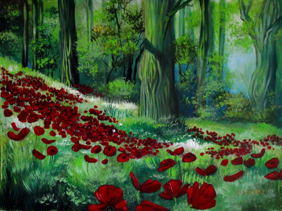
Red Poppies in the Forest

Zebra Love

Blue Poppies in the Meadow

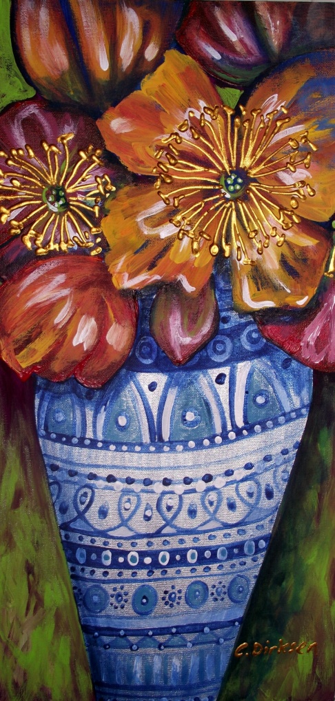
Vase of Poppies

Rhapsody in Blue

Blue Poppies — Finding Beauty in Chaos Series

All the paintings above are sold but they are available as greeting cards and prints (just click on the image to take you to RedBubble).

Have a happy and productive Wednesday!

FREE BOOK GIVEAWAY

Get your FREE copy of ‘Creative Expression’ HERE

Or, alternatively, it can be purchased as a paperback at lulu.com.

“Bite size teachings on how to express your creative flare and how to ignite your passion for life.

Learn how creativity is food for the soul and that the world is just waiting to be shaped and moulded by you – the co-creator of your reality.”

My art portfolio book is available HERE to purchase or just to browse through (click ‘preview’ under book icon at lulu.com)…

Art Commissions — The Soulworks Project (Part 1)…meeting with the client

A step-by-step guide on how a commission is put together

A lot of artists would like to know how one goes about starting a commission and there are also a lot of people who would like to have something commissioned but are too scared to ask.

What is the procedure and what is involved in the process of a commission?

The Key Steps

  • Meet with the client and get a feel for what they want — show them your portfolio
  • If you accept the job, the next step is to supply the client with a quotation for the job (upon acceptance of the quote, I usually require a deposit of 50%)
  • Draw up a prelim sketch of the artwork and give a detailed synopsis of how you got to this stage with the information and specs the client has given you
  • Start the job and show the client the finished work (I usually refrain from showing the client the process as it could cause confusion, as you will see in the blogs to come)
  • Present the client with the finished painting — I usually send a photograph before they actually see it ‘in the flesh’
  • Voila (oh, and get the rest of your payment!)

In the weeks to follow, I will be taking you through the last commission that I did for a very special client who wanted a triptych for her office.  I will be addressing every step that is taken up until the painting is delivered.

Today’s Art Blog is going to look at the first step:  Q&A

Step 1 — What does your client want?

This is obviously a very important step and one of the deciding factors if you and your client are on the same page.  When you have finished questioning your clients likes and dislikes, you can assess whether or not you resonate with each other and the project.

I never take on a commission that I don’t feel comfortable with.  If it goes against my style, principles or anything else, this step will let me know if I will proceed with the client to the next stage which is quoting for the job.

Here were my clients specs for this commission:

She wanted to incorporate

  • Nature
  • Butterfly (part of her logo)
  • Silver spirals/patterns
  • Peace
  • Connection
  • Mountains
  • Well-being
  • Joy, Beauty and Fulfillment
  • Inspiration
  • Passion
  • Green, purple and silver colours
More specs from the client — you can never know too much, only too little!

When we discussed these ideas, she conveyed to me that she liked the spiral patterns I use in my art (see picture below for example) and she also liked the idea of having a human form in a tree (see my other picture below).

 “It is vital that you show your client a portfolio…”

This was important information and got me on track to visualizing this piece.  It is vital that you show your client a portfolio so they can point out the colours, subjects and styles they like of yours.  It also helps the client get an idea of what you are capable of doing.

As she is having this painting commissioned for her office, we also delved into her practice and what that entails.  She is an NLP practitioner (Neuro-linguistic Programming) who wants something pleasant for her clients to look at whilst in they are in session.  It has to be something that ties in with what she offers.

Next week I will be posting the prelim sketch of the painting along with the detailed synopsis of how I interpreted her needs.

Read Part 2, Part 3, Part 4