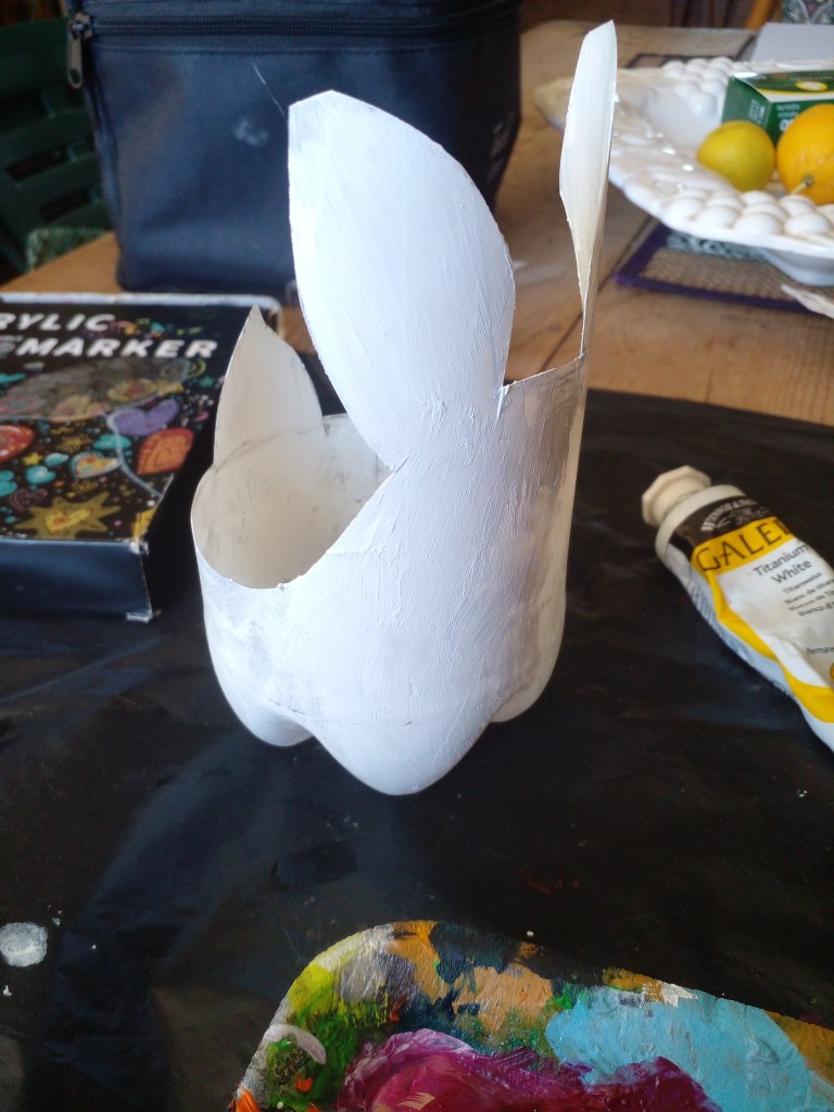
Although Easter was last weekend (I’ve missed the boat), I thought it was worthwhile sharing this upcycled plastic bottle bunny craft video because, let’s face it, it doesn’t have to be a stand-alone Easter thing. This can make the perfect gift all year round (and you can change the animal if you want).
Not only can you stash some candy treats in their for a perfect gift, but you can also use it for a cute stationary storage ornament for your desk or, drill holes in the bottom and use it as a planter (again, making for another great gift).
I have a community section at my YouTube channel where you can post your creations and let everyone see how your craft project turned out. All you have to do is subscribe to my channel HERE and head over to the community tab to post your photo’s. I also encourage the community to post anything creative they’ve been working on, it could be a painting, drawing, craft project, sculpture – anything goes. Sharing is caring!
Here’s the long-form video (if you’d like to see the short reel CLICK HERE):
Ever wanted to try your hand at painting poppies? Well, I’ve just recorded the process for your to watch at your leisure 🙂
I’ll be diving into the world of acrylic magic, where bold brushstrokes and playful textures come together to create a stunning floral masterpiece. So, follow along as I explore the joy of creating with acrylic paints and bring these gorgeous pink poppies to life.
Whether you’re a mid-journey artist or just starting out, this tutorial is perfect for anyone looking to express their creativity and add a touch of whimsy to their floral artwork. So grab your acrylics, dust off those brushes, haul out your canvas and let’s get painting!
If you enjoyed this video, be sure to check out my drawing poppies with alcohol markers below:
Join me on this mixed media acrylic painting journey as I create unique sparrow birds with a very unusual, abstract patterned background!
I’ll guide you through every step of the process — from the Zentangle layer to adding the mixed media and then finishing off with the sparrows. Learn new techniques, explore color combinations, and discover the joy of mixed media art that AI cannot copy.
Whether you’re a seasoned artist or just starting out, this tutorial is perfect for anyone looking to improve their skills, create something unique that AI won’t be able to mimic and zen out to some chilled vibes.
So, grab your paints and let’s get started!
If you want to see the full Zentangle video which marked the beginning of this painting, you can watch that here: https://youtu.be/lA8yuuy_Ams
I recently recorded myself drawing a Zentangle abstract landscape. Grab your pens and some paper or canvas and join me on this creative, chilled out adventure!
Take your creative business to the next level with handmade artist business cards! It’s not as hard or time-consuming as you may think. I took on the challenge in the video below and was pleasantly surprised with not only the results but also how my clients reacted to them.
There’s some important take-aways in my video if you’re looking to level-up your creative business strategy.
In the video below, I’ll show you how to create:
Unique,
Eye-catching,
And professional-looking business cards that will help you stand out from the crowd and elevate your brand.
I’ll explain why I chose making my own artist business cards over conventionally printing them and why this makes such an incredible lasting impression on clients.
Whether you’re an artist, designer, or entrepreneur, handmade business cards are a great way to showcase your personality and creativity. So, let’s get started and make your artist business card game unbeatable!
If you enjoyed this video, you may also be interested in this video about how to sell your art, where I divulge all the things I’ve learnt in my art career, spanning almost 25 years:
Want to learn the secrets to fixing acrylic painting mistakes?
I make boo-boo’s all the time. That’s why I love painting in acrylic — you can just go over your mistakes. But what if you’re stuck and don’t want to mess up your painting by turning something dodgy into something even worse? We’ve all been there as artists.
There’s nothing more vexing than overworking a painting to create a bigger dog’s breakfast.
But I’ve found a revolutionary trick that will help you to never make this mistake again. You can rescue your artwork from common errors and turn them into masterpieces!
Are you making these common blunders that could be holding you back from unlocking your full artistic potential?
In this video, I’m exposing the top 3 mistakes that artists often make and how to avoid them. From amateurs to seasoned pros, these no-no’s can creep up on anyone, but with some of my stories and experiences explained, you’ll be able to identify and overcome them — capiche!
Whether you’re a painter, sculptor, or digital artist, this video is for you. So, what are you waiting for? Watch now (click on the pic below) and take your art to the next level!
In my last vlog, I showed you just how much I am loving using alcohol markers for my backgrounds. Now I’m going to show you how to paint a bee on top of this background. You can recap on the background tutorial here if you missed it: How to Use Alcohol Markers on Canvas
Now, come be a fly (or bee) on my studio wall as I paint the subject matter over the poppy background. The video is under 5 minutes and I’m sure you’ll get a buzz out of it 🙂
Please don’t forget to subscribe to my YouTube channel for more art tips, techniques and tutorials! I also love hearing from you in the comments section. Click on the picture below to view the tutorial video.
Today, I recorded the whole start to finish process of drawing an entire background of poppies onto canvas – time-lapsed to 4 minutes with full commentary. You dont want to miss this! Click on the pic below:
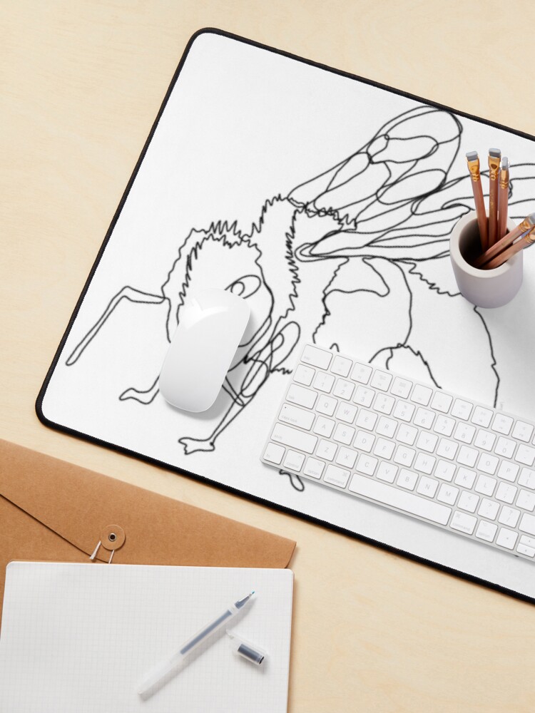
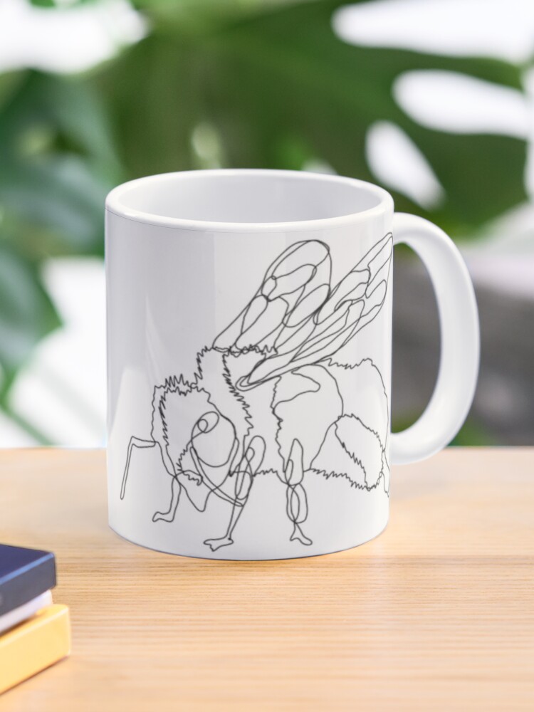
I finally decided to try my hand out at single line drawing. For those of you who don’t know the technique, it’s simply drawing something without lifting your pen/pencil.
For my subject matter I chose a bee ’cause my garden is swarming with them at the moment and it felt appropriate as we head into spring in South Africa.
So without further ado, here’s my first ever single line drawing called “Beeline.”
“Beeline” by Cherie Roe Dirksen
I’d love to know what you think, please leave a comment 🙂
Have you ever tried your hand at single line drawing? Why don’t you send me a link in the comment section? I’d love to see!
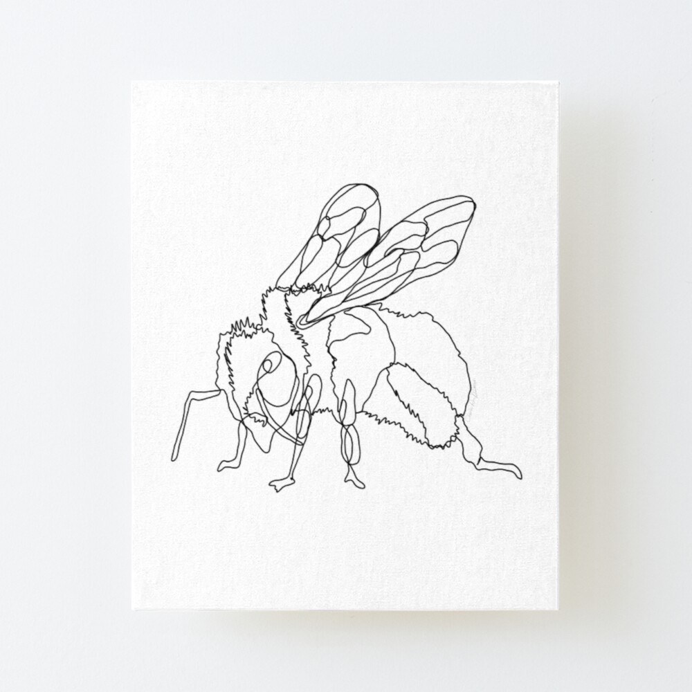
I’ve got a selection of products featuring this design, I’ve selected a few below to whet your appetite. Just click on the picture to take you to the store:
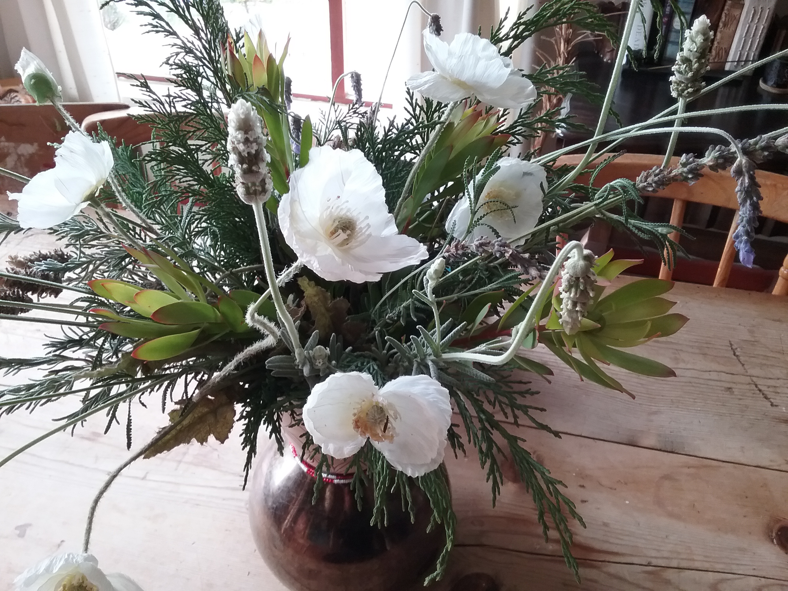
I’ve been having fun with some still life drawing.
I gathered a bunch of flowers and foliage from my garden for my dining table centerpiece and, one day whilst taking in the beauty of the flowers, decided to draw them. You can see my vase of delights to your right.
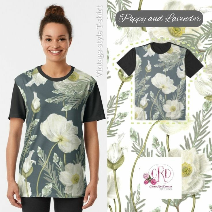
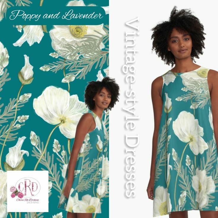
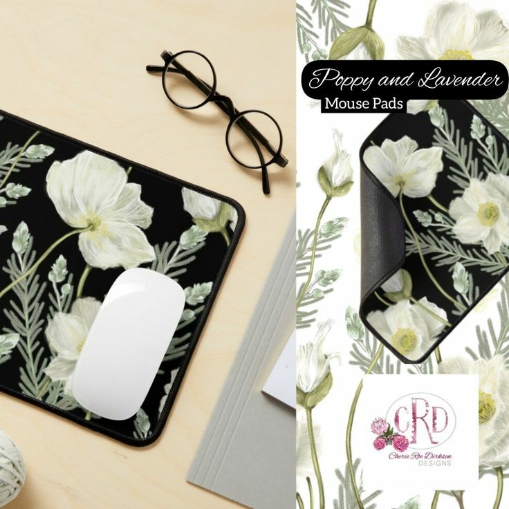
I really love vintage-style botanical pattern in design so I tried my hand at creating one of my own with these lavender and poppy illustration I had done.
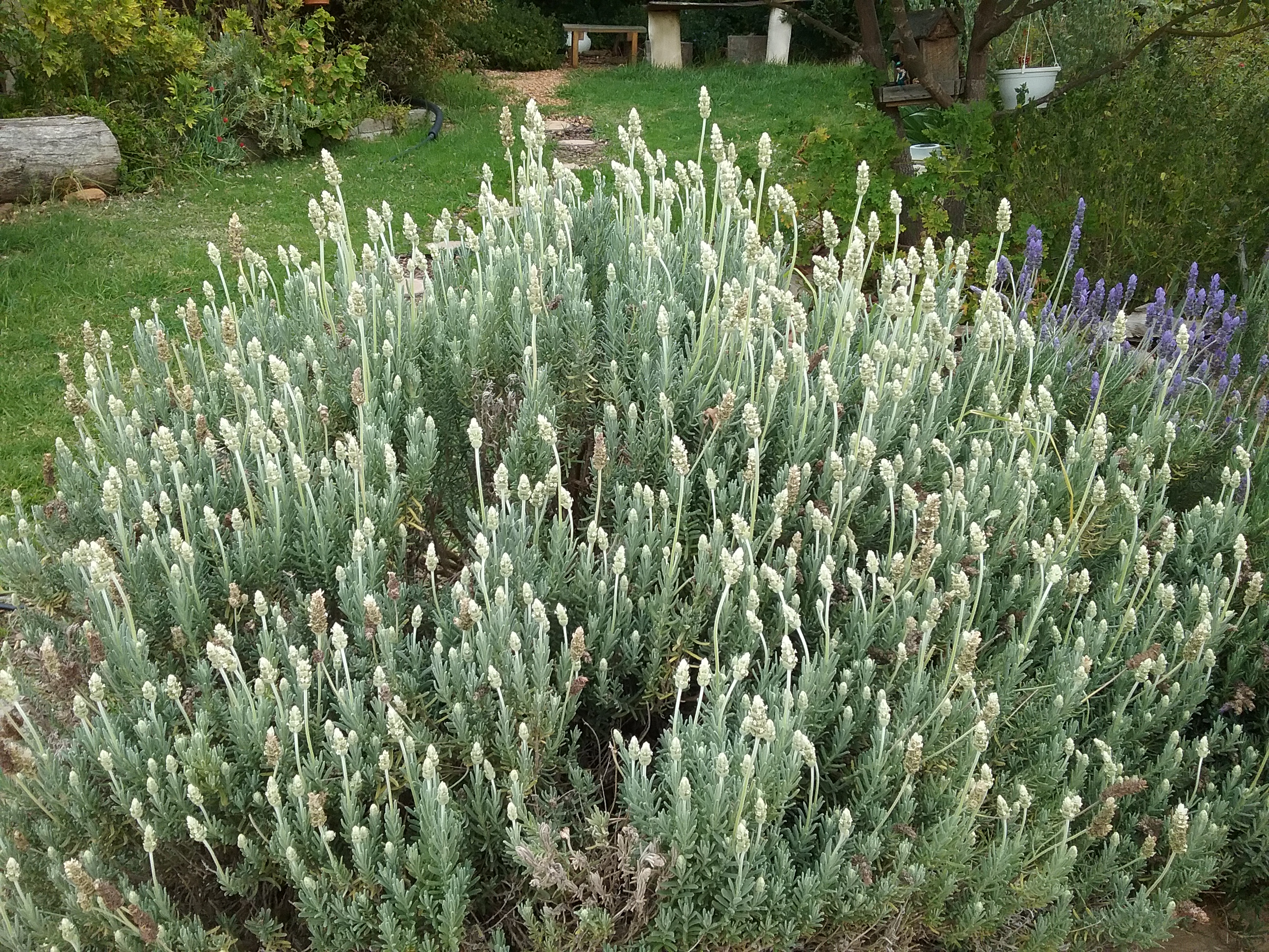
Are White Lavenders a Thing?
I’ve had many people ask me if there really is such a thing as a white lavender. I’ve got to be honest, I would’ve been disbelieving too if it wasn’t for a few years ago when I saw my first white lavender bush in someone’s garden on one of my morning walks.
I had to have one!
For the naysayers out there, let me introduce you to my gorgeous white lavender bush (you can see my regular purple lavender bush next to it for a colour comparison) in my little Karoo garden in South Africa…
My white lavender bush 🙂
Isn’t it magnificent?
Below is a close up snap:
Close up snap of the White Lavender
And yes, they smell as good as they look!
Let me know in the comments below if you’ve ever seen or own white lavender? I’d be interested to know. Please also include where you come from.
Back to the Illustration…
So without further ado, here is my botanical illustration featuring the white lavender and poppy combo:
White Poppies and Lavender Botanical Design by Cherie Roe Dirksen
I really had fun creating this botanical pattern and it’s even more rewarding when you start designing various products and get to play with background colours – I especially like the teal background.
Below are a few of my products with this pattern, if you would like to visit my store and see all the available goodies, PLEASE CLICK HERE.
I’d love to hear which product stands out for you – let me know in the comment box below 🙂
Thanks for reading!
I’ve got a new Mandala Colouring Book for you! Click on the pic below:
I know I’m not alone in absolutely loving the Back to the Future Trilogy. Everything about these movies transports me back to my youth and the wonder of time travel being a possibility in the future (and the mind-bending dichotomous perils that doing so implies).
What is your favourite scene from this trilogy? I’m going to reveal mine later on in this blurb.
But let’s get back to…er, the future? Why is the 21st of October Back to the Future Day?
Well, because that is the date Marty McFly originally travels to the past and catalyses this epic existential time-traveling adventure.
The quintessential moral behind the trilogy revolves around Marty’s pride and caring too much about what people think of him, which get’s him into a heap of trouble. He ultimately relinquishes this egoic pitfalls and becomes self-realized (in an 80s adventure movie kind-of-way).
Another more touching aspect of the movie is the love-across-time theme. And who could forget Huey Lewis and The News’s gigantic hit, The Power of Love? Well, let me tickle that memory just a little bit with this video:
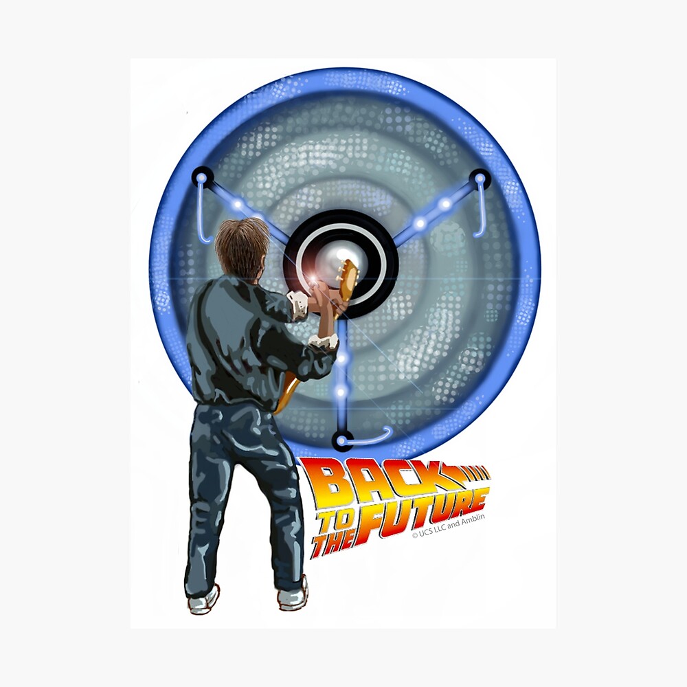
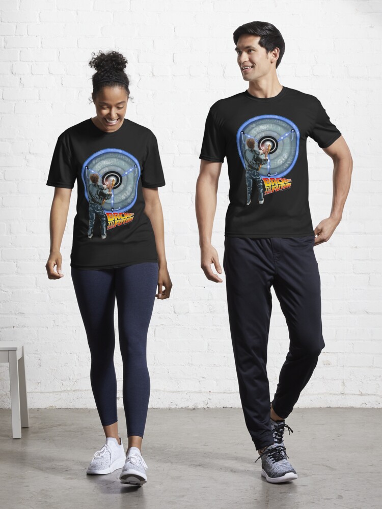
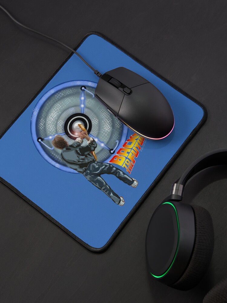
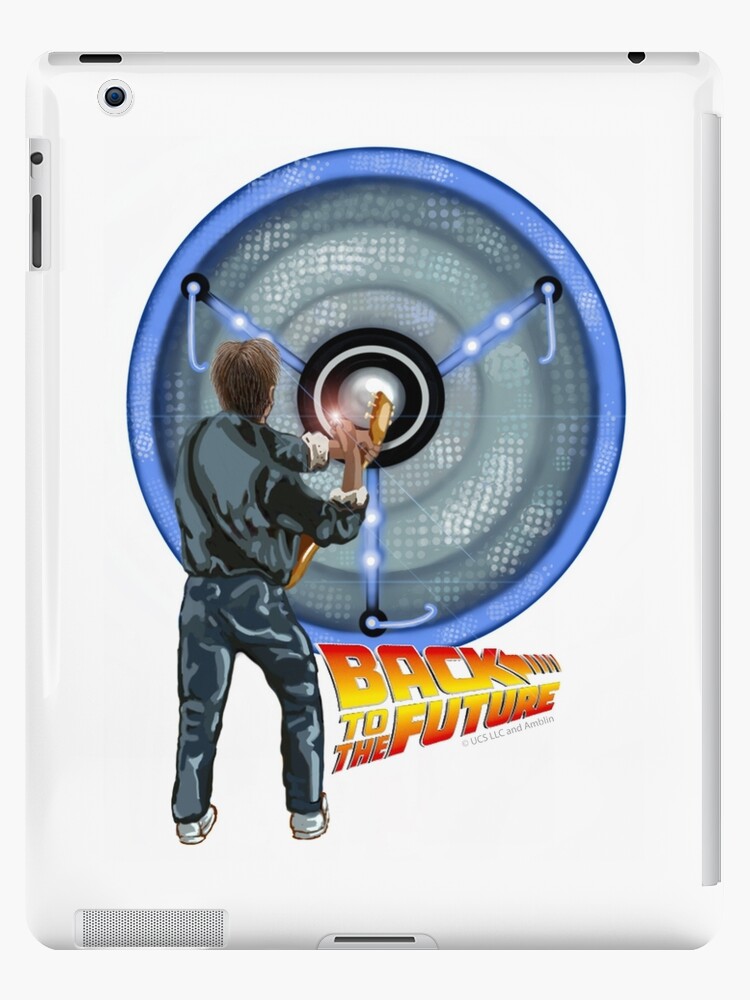
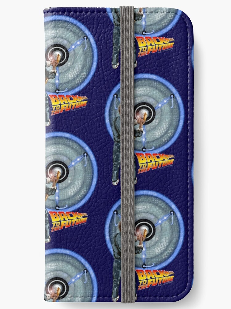
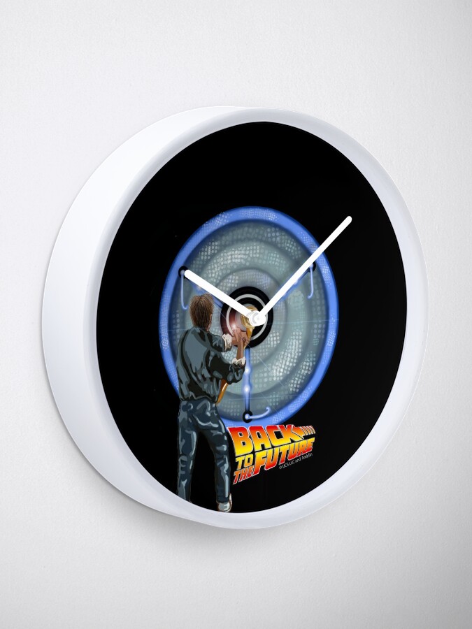
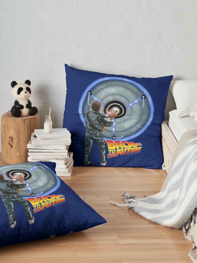
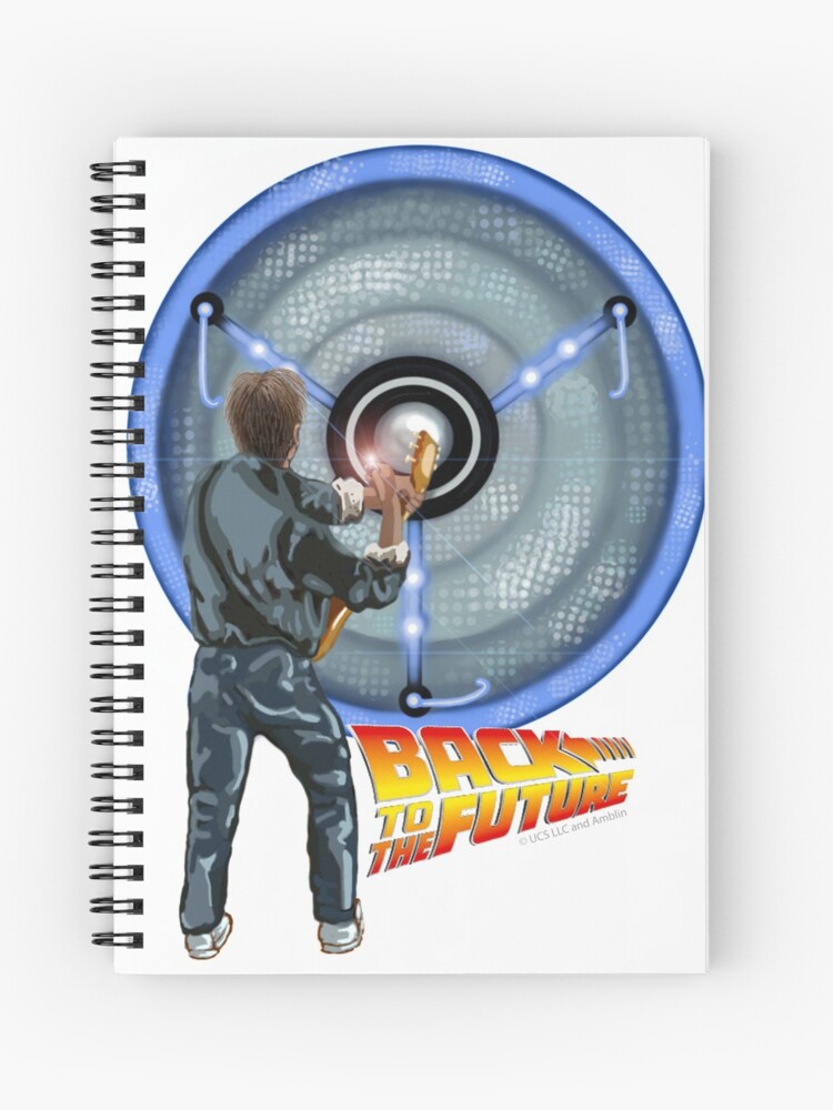
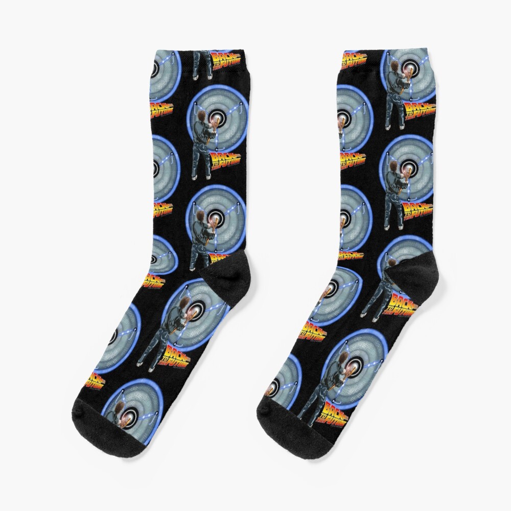
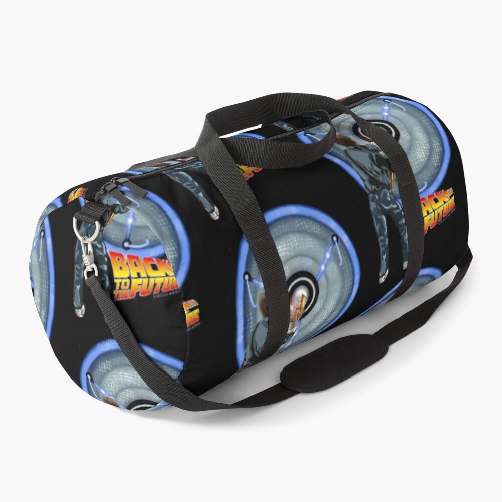
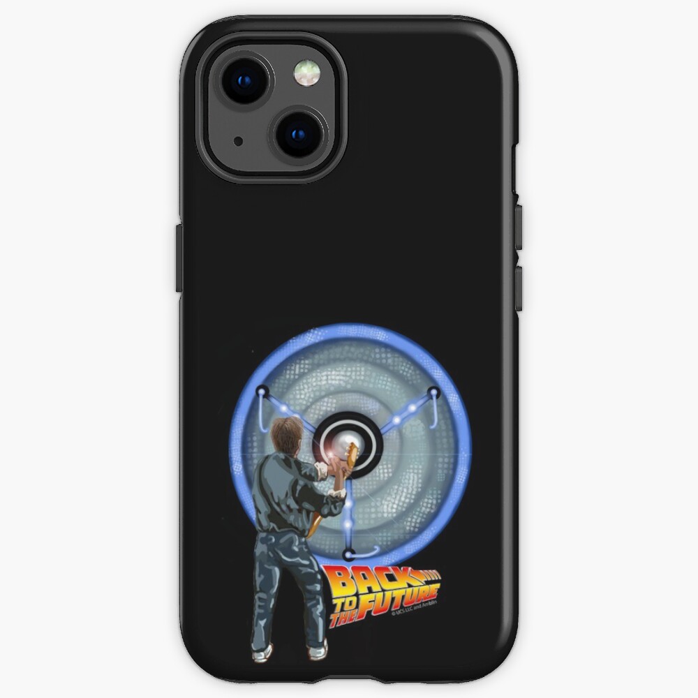
I recently collaborated with UCS LLC & Amblin and Redbubble to come up with an illustration/ digital design for the Back to the Future franchise and I picked my favourite scene of the movie, which just happens to be the opening scene.
Yip, you guessed it, it’s Marty plugging into Doc’s amp and blowing himself away. I can’t help wetting myself every time I see it. So, I chose that to be the main element of my design, with one tweak — the amp had to be the flux capacitor, seeing that Marty was just about to embark on his epic life-changing journey.
Here it is, what do you think?
Here’s the scene to refresh your cache:
Don’t forget to let me know what your favourite scene is in the comment box below!
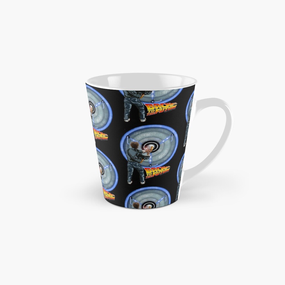
Here are some of my favourite products with this design:
A recent initiative to rekindle hope and celebration in our beautiful community of Barrydale, South Africa, has resulted in 944 prayer flags being made by the children of our disadvantaged community along with residents and local artists alike.
In combination with this uplifting flag installation, the team at Net vir Pret worked with the University of the Western Cape and their Centre for Humanities Research to bring the world, Reboot Eden: Celebrating Ten Years of Puppetry in Barrydale.
Reboot Eden will be an online program of four new puppet performances that will be available online from the 16th -19th December 2020, so follow their Facebook account to tune in and watch these incredible life-size puppets in action!
The prayer flag committee first met early August of this year to brainstorm a way to bring the community together in a creative and positive way, and this is what transpired…
They set out to create something positive, something artistic, something creative, something that the whole community could be involved in and as a result of an astounding group effort, 944 Prayer Flags of Hope will line the streets of Barrydale from 14 to 19 December.
The children and interns of charity orginisationNet vir Pret painted most of the flags under the guidance of their teacher, Cherie Dirksen, while the rest of the contributions came from local artists, businesses and villagers.
In fact, to illustrate just how village-focused this initiative became, we can today reveal that radio presenter turned axe-man Rueben “the screwman” Hart serves on the hanging committee.
Earlier this year Rueben played his axe in the Dung Beetle and Country Pumpkin restaurants and he is now part of the flag hanging committee that will in charge of decorating the Karoo Art Hotel and other places of interest.
The project is the brainchild of the prime genial Mez Karoo Kitchen owner Michelle Berry who, during the early days of lockdown, rediscovered a box of prayer flags she had made for a Barrydale in Bloom celebration of years gone by.
She instinctively knew it would be of great value and relevance as the world entered a strange space in time.
With her foresight a group of about 40 people united and focused their energy on sending out a message of optimism during the most uncertain winter in human history.
“A prayer flag has a positive connotation and during this time we thought it would be appropriate to do something that brings hope and reminds of the dreams we have,” said Michelle.
She was quick to point out that everyone she had approached to help with this idea had jumped at the chance to contribute. One of the first persons was Cherie and subsequently her under privileged art students became involved.
From sometimes unsung heroes at Net vir Pret like Herman Witbooi and Clarisa Esau to seaming sensations Richard Panaino and Katye Lovegrove, the willingness to contribute was overwhelming.
Businesses support worthy cause: Picture: Cherie Dirksen
Even the local poetry society pitched in and their work will form part of the 10 flags from the town’s artists that will be on display at the Karoo Art Hotel in what is a very fitting reminder that the Barrydale Art Meander will also be in full swing during this time.
“It was a real community effort and we owe a lot of gratitude for a lot of people,” Michelle added.
She highlighted that a donation of table runner material by Arran Bastable of Barrydale Hand Weavers was very generous indeed and with the contribution from Colour Screen Fabric Paint in Cape Town they were all set for action.
As always, Ant Chidrawi of The Hub also contributed in his unique way by providing stencil work at no charge.
Flags of Remembrance
He will be missed. Gari Crawford. Picture: Facebook
Just a few weeks prior to the finalisation for the Prayer Flags of Hope, Net vir Pret and the community of Barrydale suffered a huge loss when beloved and respected music teacher Gari Crawford passed away following a stroke.
Gari had just completed a compilation of 10-years of music Net vir Pret created as part of their annual Puppet Parade.
“There was a general consensus that we wanted this project to be about hope and celebration of last 10 years of Net vir Pret, but we did not expect this sad setback,” Cherie explained.
Cherie made it her task to ensure that that flags representing the love that exists for the mentor Gari were created and that in doing so, the music maestro’s life would be celebrated.
She fought off her tears when she explained just how moving this final tribute to a much loved turned out to be.
A final tribute to the inspirational Gari Crawford. Picture: Cherie Dirksen
Flags can become part of annual event(s)
Due to Covid related reasons the annual Puppet Parade was cancelled, although some of the the puppets that donned the streets of Barrydale over a decade will be on display in pre recorded puppet shows that will be broadcast online at certain times as part of the Barrydale Art Meander (BAM).
The 944 Prayer Flags of Hope that were created will be sold in bundles of 20 from the Magpie Art Gallery on December 19 and should any of these reasonably priced items go unsold, they will be utilised for 2021 celebrations.
All proceeds wil go to Net vir Pret.
Michelle noted that the flags will not be expensive and that Cherie might as well brace herself for the pressure related to producing such great volumes of excellence.
Inspirational Prayer Flags of Hope
Cherie unofficially confirmed that they would double the number of hand crafted flags next year and fully supported the idea of creating these decorative gems annually.
“I was taken aback with Michelle’s idea and I immediately thought this could become a yearly event.”
“What a lovely theme for attracting tourism back to Barrydale. It is something positive, something artistic, something creative, something that a whole community can be involved with.”
Now wouldn’t it be great if YOU could start a prayer flag initiative in YOUR community? Let prayer flags and messages of love, hope and unity go viral globally!
Below you’ll find some more pictures of the giant puppets and some of the flags that will be on display:
Thanks for looking!
Cherie Roe Dirksenis a self-empowerment author, multi-media artist and musician from South Africa.
To date, she has published 3 self-help and motivational books and brings out weekly inspirational blogs at her site www.cherieroedirksen.com. Get stuck into finding your passion, purpose and joy by downloading some of those books gratis when you click HERE.
Her ambition is to help you to connect with your innate gift of creativity and living the life you came here to experience by taking responsibility for your actions and becoming the co-creator of your reality. You can follow Cherie on Facebook(The Art of Empowerment — for article updates). She has an official art Facebook page (Cherie Roe Dirksen – for new art updates). You can also check out her Facebook band page at Templeton Universe.
Most of you may know, I live in South Africa where, of course, wildlife is abundant. Especially a particular type of mischievous (as well as dangerous) primate called a baboon.
You may even recall an incident I had many years back which involved me, a tub of butter and an alpha male baboon. You can recap on who won that particular battle here: The Baboon and the Butter — Part 1 .
I moved away from Welcome Glen in Cape Town, where baboons terrorized the locals, to start my sustainable living adventure here in Barrydale. Barrydale didn’t have the baboon problems of where I’d come from. Or so I thought.
Yes, I was insanely wrong about that.
Although we had a peaceful first four years, things started to change rapidly once I started a successful fruit and veg garden.
Utter Ruin
I got hit hard by a solid week of visitations by troops of baboons in December 2019, and the truth hit hard too.
I had beautiful crops of almost ripe onions (which take around 6 months to grow), potatoes, apricots, apples, almonds, peppers and Swiss chard. They didn’t stand a chance. The baboons ravaged my crops in minutes. I was devastated after putting in so much hard work, as you can well imagine.
To add insult to injury, they don’t even eat chard or peppers but they pulled it all out and left it on the ground. Pfft.
Problem vs Solution
Needless to say I was livid and despondent. I don’t wish any animal harm, so I would never hurt them but I couldnt see a way out of this gigantic problem. Someone suggested I give up my dream of an edible garden. No way, Jose. I’m probably a sucker for punishment but I can’t do that either.
After an excessive period of feeling incredibly sorry for myself, I decided to try and find a way to alchemize this situation. Here’s what I came up with:
Baboons aren’t all bad. Yes, they’re smelly, destructive and deadly dangerous with massive fangs and no fear for women (known fact look it up. Utterly sexist little maruading bastards). However, they are very amusing amidst the mayhem. I’ve had many a giggle watching them frolick in their troops, play daredevil on the R62 with oncoming traffic and torment the tourists by grabbing their freshly acquired snacks in an ambush.
Their babies are incredibly cuuuuuuute. Ag vooitog (Afrikaans for ‘Oh bless’ or something like that).
I can’t think of a third plus but let’s just say the world wouldn’t be the same without a bumbling band of baboons!
After my above conclusions I decided to:
Concentrate on growing things they don’t eat like herbs, green spinach, beans, chili’s, peas, lettuce, etc. They seem to prefer root vegetables. They also didn’t touch my grenadillas or my gooseberries, which I found strange but somewhat comforting.
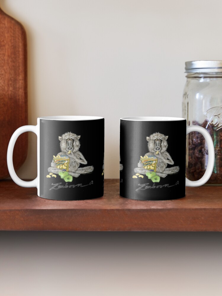
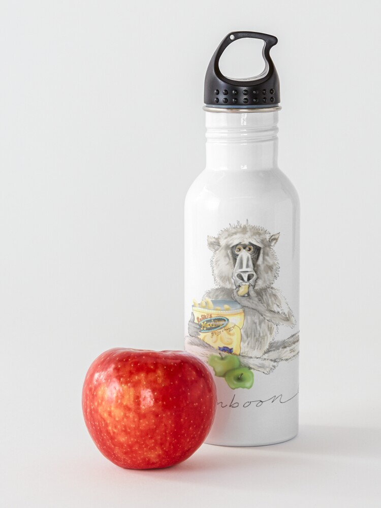
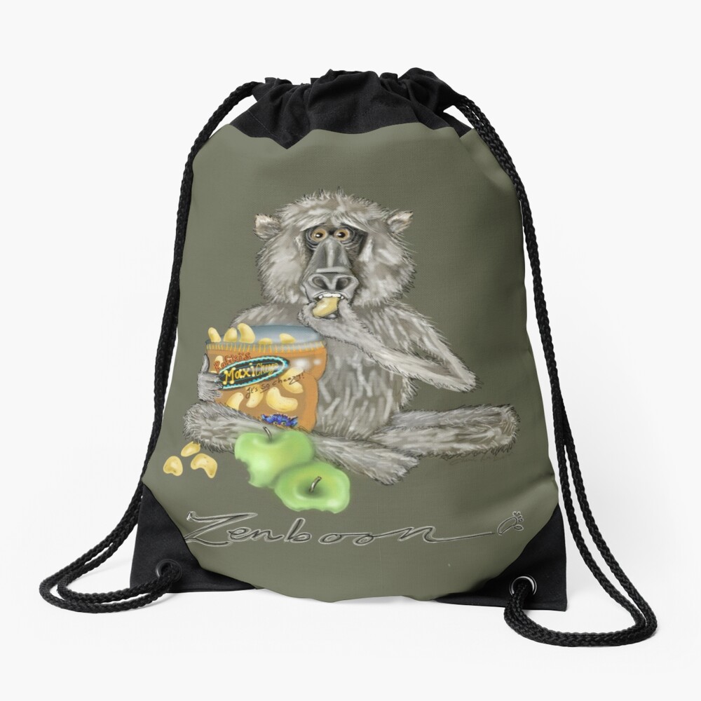
Make myself laugh rather than cry. After reminiscing on all the funny moments they have provided, I came up with ‘ZenBoon’.
The Zenboon Revelation
I’ve decided to put pen to paper, brush to canvas, digipen to screen and I’m drawing my cheeky little friends in an attempt to shed a more humorous light on the whole ordeal. The idea of a Zen baboon is ludicrous and certainly dichotomous (A word that irrelevantly rhymes with hipopotamous). However, these monkeys have gained mastery over mischief. Aka ZenBoon is born, my way of alchemizing my low-lying mood.
So, my lesson in all this is don’t let it (insert your problem here 😉) get you down, let it get you thinking ANEW. You always have a choice.
Here are two designs I have already come up with below, I hope you like them ☺🐒 These crazy fella’s are available on all sorts of products from posters to shower curtains (see below). You can see the full shop scope here and here.
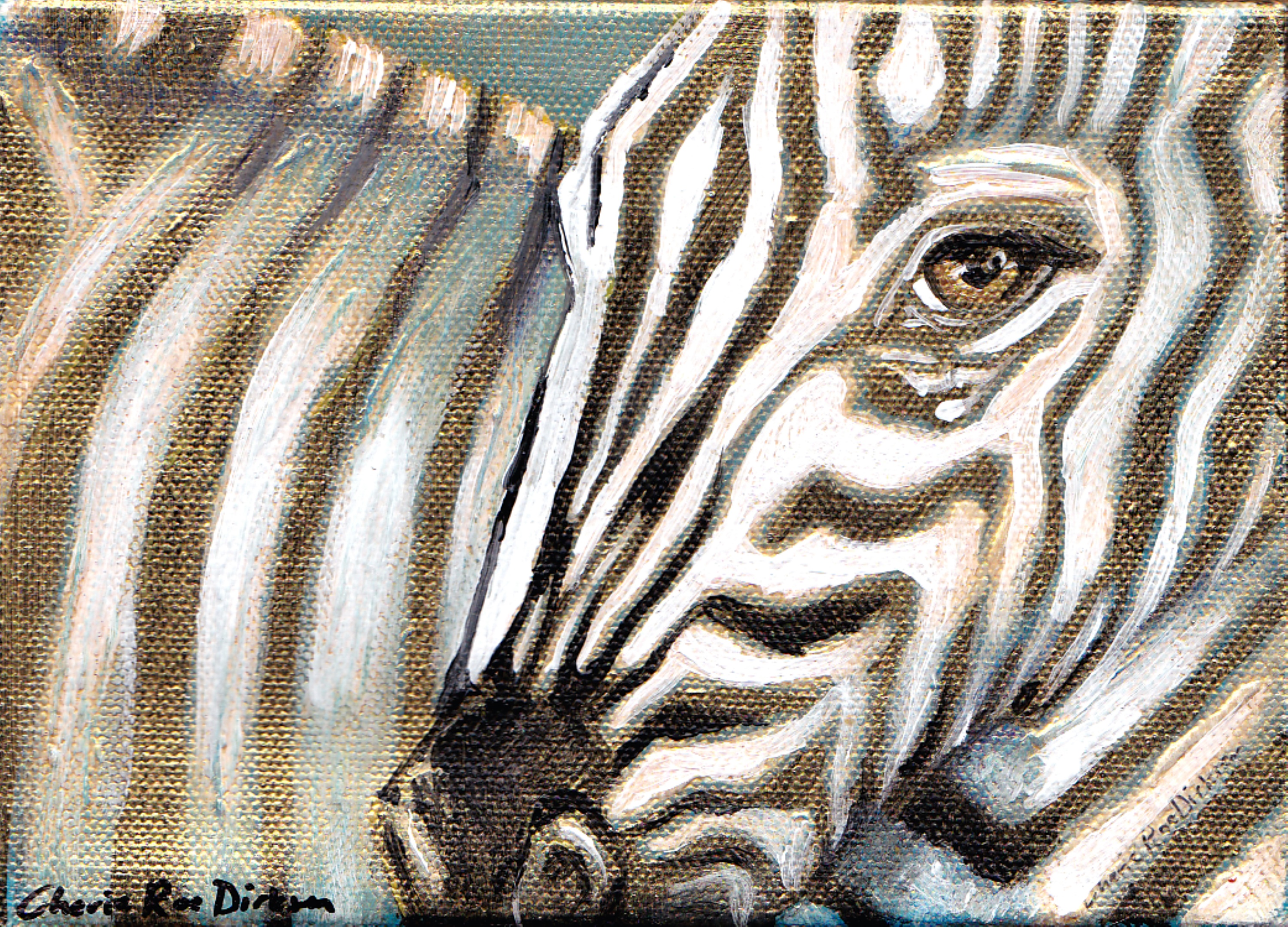
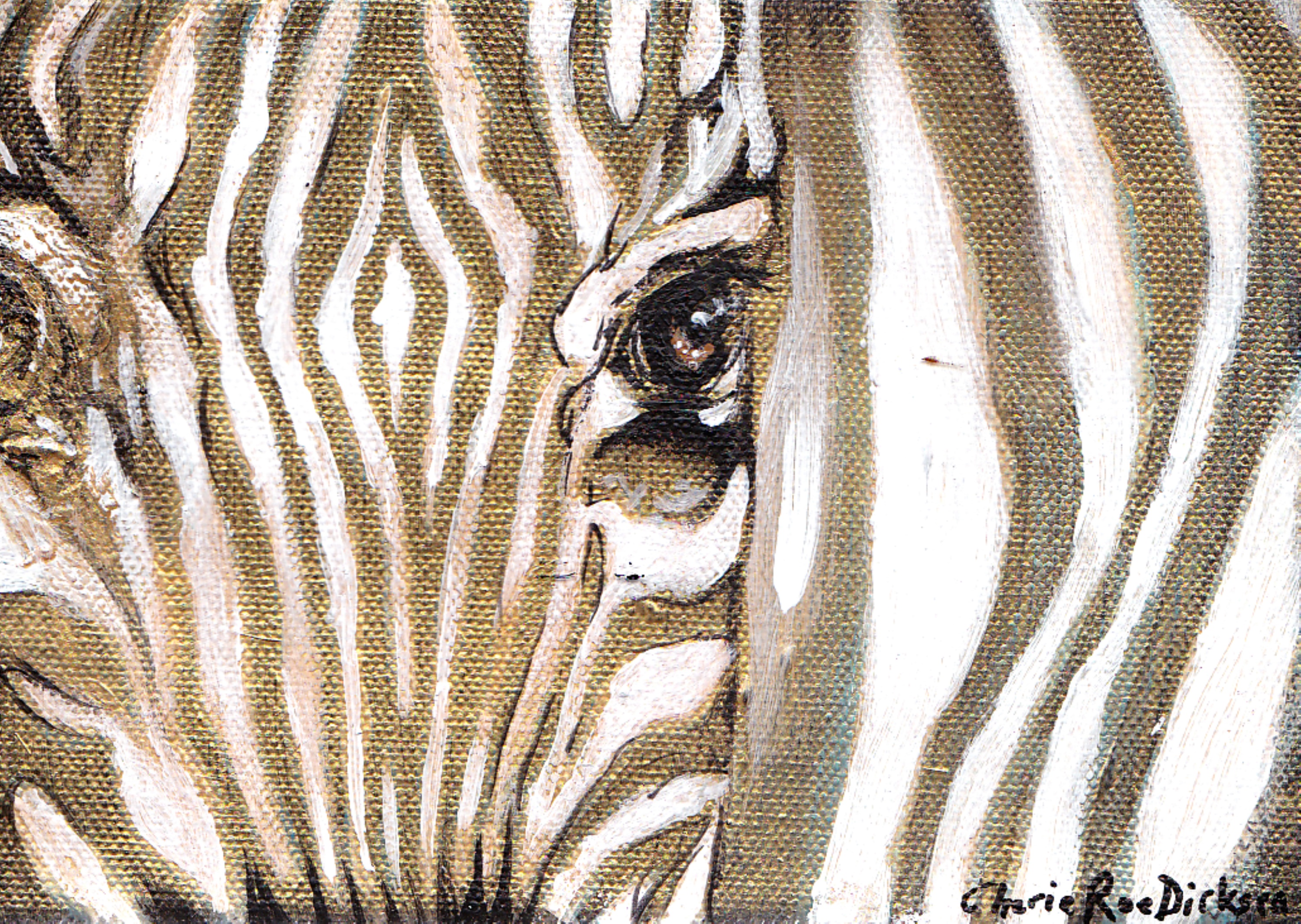
I’ve been experimenting in the studio with my favourite colour a
t the moment — gold.
I can’t stop myself from adding highlights, splashes and just general copious amounts of gold to my paintings.
I have finished 2 little zebra paintings with these gold overtones and just love how they’ve come out. I can’t seem to catch it on camera, but when the light hits these little pieces they change completely. It’s almost like the hit another dimension…very abstract darling, with a hint of magic 🙂
So far I’ve covered (with lashings of paint and canvas) Radiohead, The Beatles, Jeff Buckley, Pink Floyd, Skunk Anansie and Templeton.
I’ve just worked out that it has been a whole YEAR since I did painting no. 6! Where has the time gone?
Couldn’t Have Planned it Better
I’m a firm believer in things happening in their own time and for the right reasons and this painting just happens to coincide with the hype to the release of Muse’s 7th album, ‘Drones’ — due out on the 8th June, 2015.
I would like to say that this painting was finished a few weeks ago — before I knew what the album was called — and due to unforeseen circumstances (me and my hubby, Mike, having had the privilege of being in the movie, ‘Detour’ being filmed in our town and then us both getting ill on top of that!) I haven’t had the chance to reveal it yet.
Drones, Clones and Blood
What really struck me when Muse released the name of the album ‘drones‘ (and all three of the members having their eyes blacked out on one of the promotional photo’s) was that there were (in the painting) strange clay-like creatures that immediately emerged from the middle of the canvas and I jokingly said to Mike that they look like ‘clones’.
One of these clones even has wide, white, staring, blank eyes…eerie or just proof of quantum revelations? Can we really pluck things from the ether before they are physically ‘out there’ — i.e. did I tap into what was going on in the Muse studio?
I really dig how this works!
A friend of mine got a sneak peak over Skype as I was in the process of painting this and asked me what all the blood was about in the center of the painting. At the time I had no idea because, as most of you know by now, these paintings materialize themselves — I’m just acting as the conduit.
Muse just released their first song ‘Psycho’ with a video on Saturday and as it started nearing the end, the penny dropped…
There was blood all over the one characters face and the song is generally about the ‘manufacturing’ of soldiers to become mindless killing machines.
I hope I’m whetting your appetite here. Cause further down I’m going to take you on the pictorial process — the start to finish photo’s of what is called ‘Resurrection’.
The Evasive Message Behind the Art
In next weeks blog I’ll be taking you through the emotions that came up whilst painting this so we can get a better perspective of what this artwork may represent.
Personally, I’m still a bit in the dark and will have to mine the painting to extract the subliminal message by unpacking the words I jotted down on the sides of the canvas.
So, without further ado…let’s have a look at MUSE on canvas:
And now for the grand reveal…
‘Resurrection’ — Muse (Rock Art Series) Prints available – CLICK HERE
Well, we’re 2 months into our ‘country move’ and loving it. We (Mike and myself) started running out of our renovation fund within about 2 weeks of our move — which was, to say the least, unsettling.
We had to come up with cost-effective solutions and fast!
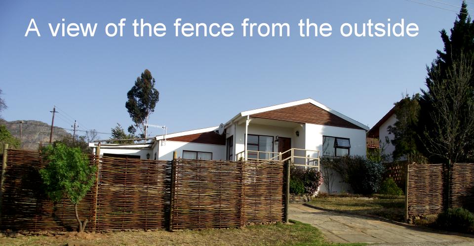
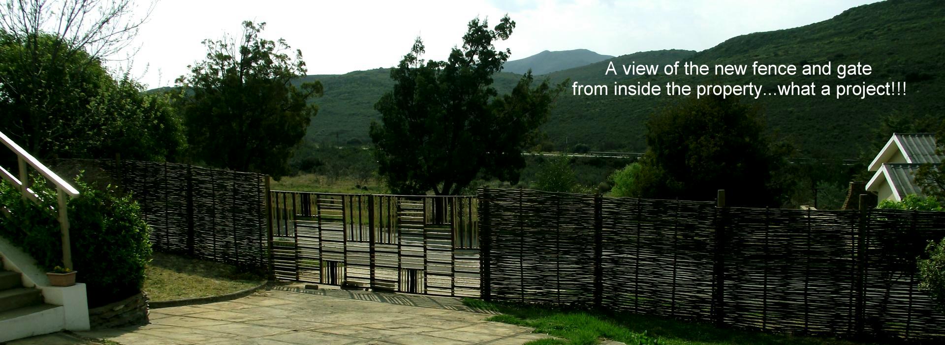
In an attempt to continue with our plans on the cheap, we decided to erect (and design) our own fence and gate. This was no small task as neither of us are exactly carpenters or builders. However, we both have a bit of artsy fartsy in us, so….
The Natural Look
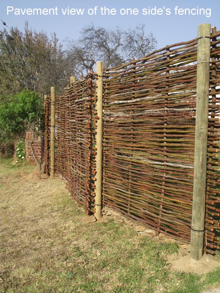
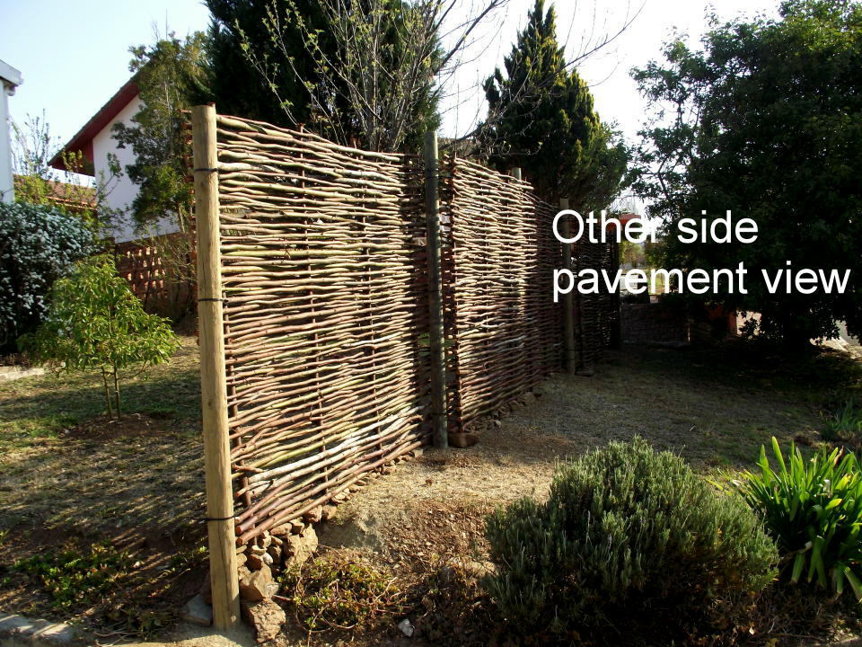
We wanted a front fence and gate that blended in with the garden. The plan is to eventually grow something nice and smelly, like Jasmine, all over the fence. So we just needed a structure for now.
We sourced a local genius who makes 2m long fences out of branches and that looked really stunning, so we ordered enough lengths for the job (it worked out to roughly $20 per fence and we needed 10).
So, no, we didn’t make the fencing ourselves but we did erect it.
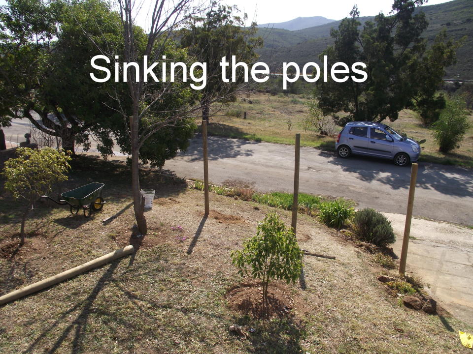
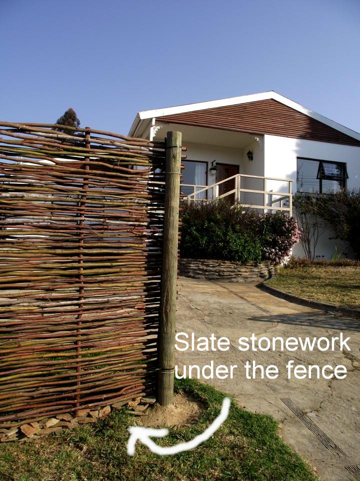
We then sunk our own wooden poles (a job I would wish upon no-one as we had to dig half a meter holes — 10 thereof — and we hit bedrock at about 10cm!). We then attached the fencing to the poles.
The property is on a slope — so that was also challenging.
We had to raise the fence slightly off the ground so it wouldn’t rot and I neatly packed slate stone at the bottom for it to rest on and because it looked nice! 😉
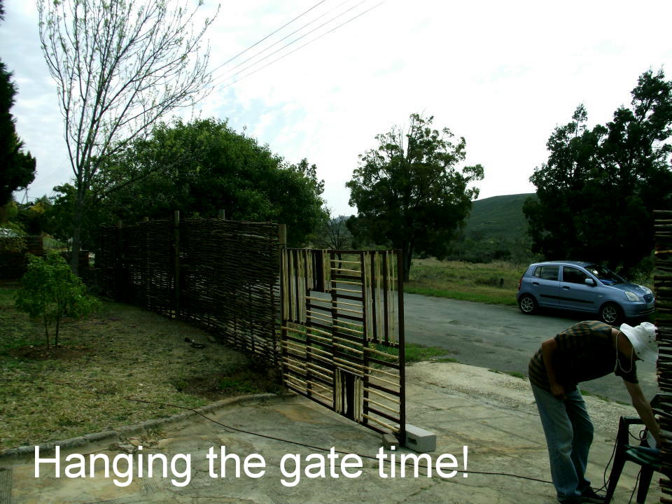
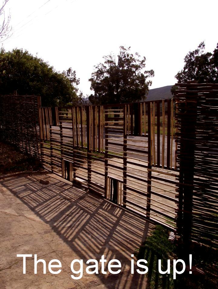
The Gigantic Task of a 4.6m Gate
We were, at this point, really happy with the fence but we needed a gate to finish off the look and to secure the yard for Purdy (our little tortoise-shell kitty). The budget was dim and we needed ideas fast.
I ordered some wood from the local co-op and built the frame for the 2 gates (2.3m per side) and we got to work filling it in with repurposed materials.
I used some wood from my empty stretcher frames (from my paintings that were rolled and sent went sold) and some reeds that my in-laws said we could use that were just lying about their garage. I also had some metal sheeting tucked away in my studio for a rainy day and it was storming outside! lol…
Well, instead of me going on and on about the process…let me show you how it all took shape:
I hope you enjoyed taking the visual journey with us! 😀
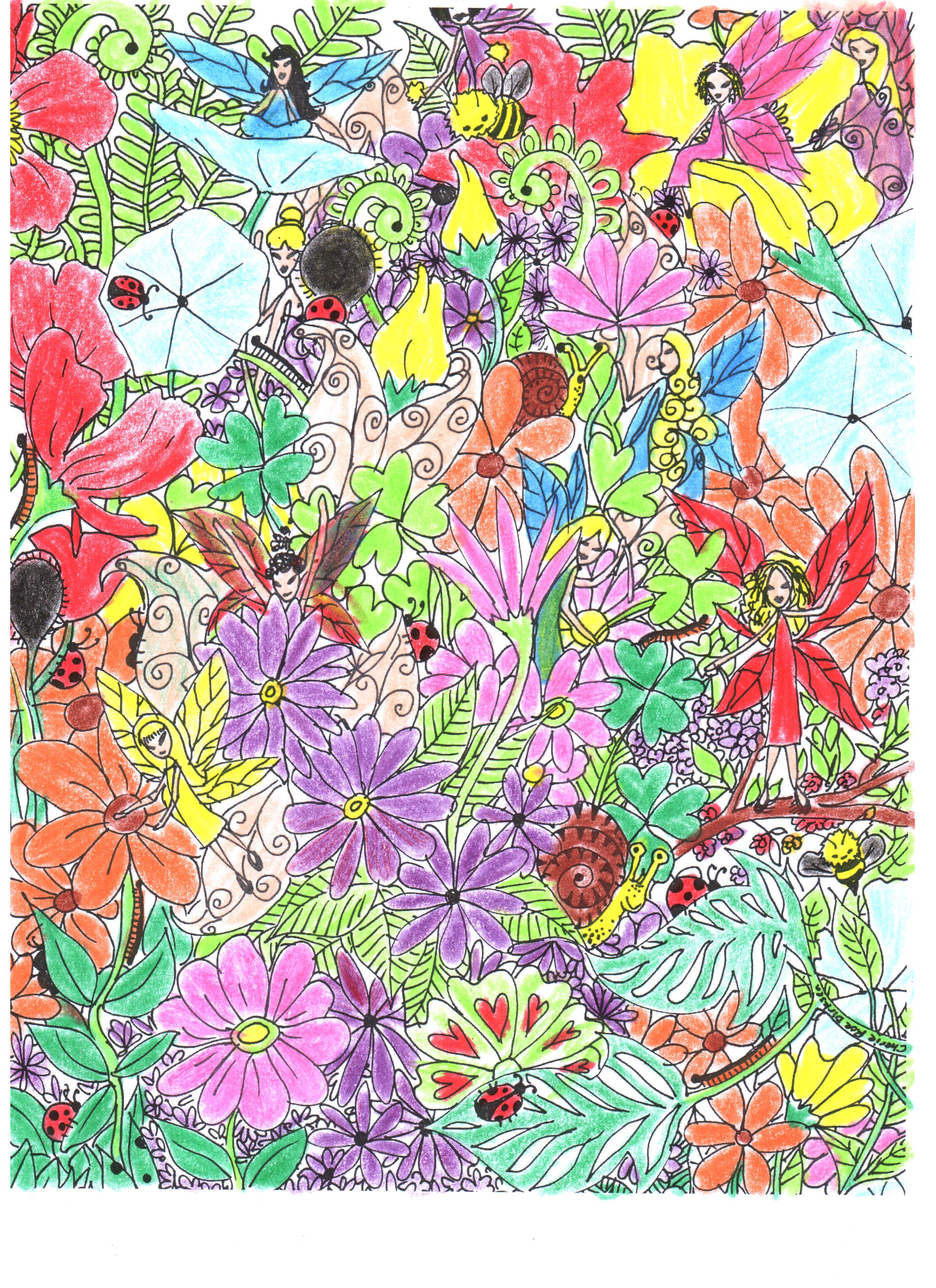
I sure have been! That’s why I started doodling again (sounds rather dubious, doesn’t it?).
I used to draw fantasy pictures when I was younger (in my teens) to relieve anxiety or tension and it really worked. I found myself reverting back to it again this week and it really helped me to unwind.
I know this might be a strange blog for me (or maybe not? Can’t seem to figure out who I am anymore anyway…lol) but I thought maybe you will appreciate it. I finished creating this ‘fairy garden’ picture (see below) last night and I wanted to get you and/or your children/spouse/best friend/neighbour/dog/cat/hamster to join in with printing it out and colouring it in!
Go on! Let’s have some fun, for Pete’s sake (Pete could really use a bit of shits and giggles right now).
Dust Off Your Pencil Crayons, Khoki’s and Paints!
So, your homework (or colour therapy work) is to print this out and splash your unique version of hue onto it (scroll to the bottom to see some of the finished pictures I’ve received from y’all).
Then, I would love you to e-mail me the finished version (cheriedirksen@yahoo.com) and I will put them all together in a blog for the whole wide world to see (you can remain anonymous or let the globe know who the genius is behind the crayons!).
Get In-Touch With the Inner Sense (Innocence) of the Inner Child!
Is this a glorified colouring-in blog?
YES!!! It damn well is and you’re going to have so much fun doing it :)…so without anymore procrastination, here it is (just click on the picture to take you to the bigger version and then ‘save as’ and ‘print’):
Have oodles of fun (because that’s the point and don’t lose sight of it!) and I will publish the finished results in a few weeks, so do try to get me your finished piccie within the next week or two. I am also going to colour this in, in case you were wondering — so don’t feel alone and overwhelmed! 😀
Oh yes, and see if you can spot the 10 fairies, 2 bees, 2 snails and 8 ladybugs.
Isn’t it great to be a child again?
Adios!
If you enjoyed coloring this, then maybe you’ll like my Mandala Colouring Book, click on the picture below – it’s an instant download/printable – and you can get colouring straight away! Did you know that colour therapy is proven to reduce stress and anxiety? You’ll find everything you need to know about the impacts of colouring and your health in the introduction of this book:
If you would like to GO LARGE, I also have this picture available as a poster (in 2 different sizes) at my print store (you can order yours by CLICKING HERE). What’s more is I have this design available on all sorts of products like mugs, t-shirts, skirts, leggings, so you can even get yourself some glass or fabric paint and go mad! Or enjoy as is 😀
UPDATE: Here are some of the beautiful colour renditions I have received from you and your families! Don’t forget to send me your finished product and I’ll post it here 🙂
Received from Anna (5 yrs) — Cape Town
Received from Mandolin — Durban
Another version received from Mandolin (Durban)
Thank you for your lovely, colourful and bright masterpieces!
Want to see more of my ‘fantasy art’? Click on link below:
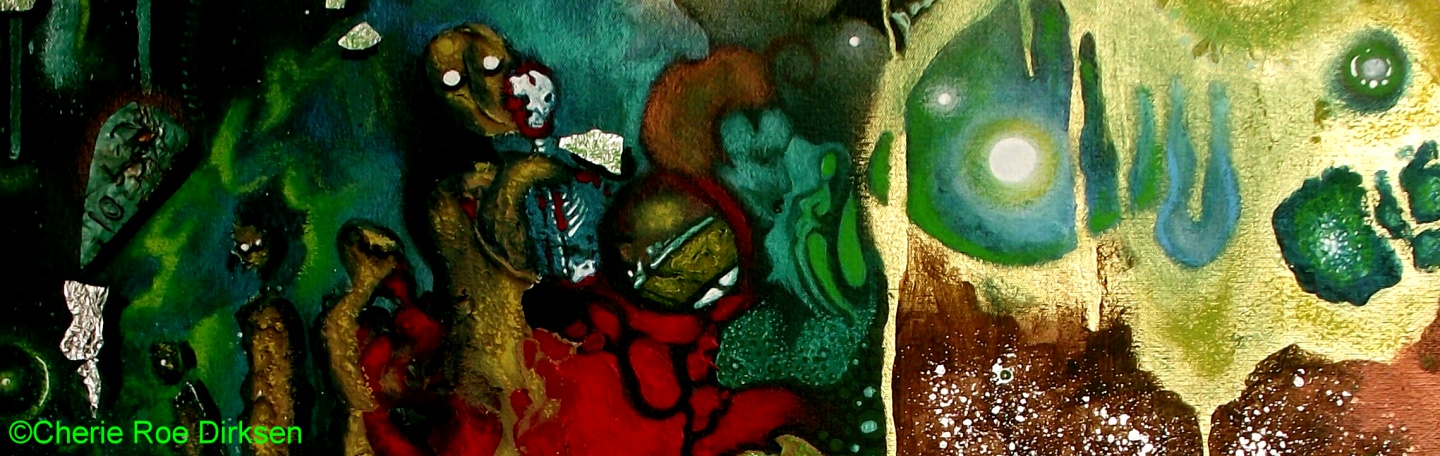
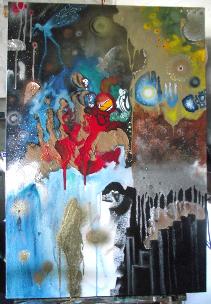
Whoa. This painting was a difficult one to physically manifest. Just when I thought that the Pink Floyd Rock Art painting had done my nerves in, this one came to slam dunk me in a vat of excrement!
Not only did this piece take me close onto 3 months to complete but I felt like I was resisting finishing it right up until the last moment. In hindsight, I think I know why…
First Things First
Before I get into the personal details of my past-life drama karma (yes, you read right, this painting started ripping into my own akashic records — how riveting!), I want to go through the emotions that came up for me whilst painting this and, of course, reveal the painting itself.
*Drum Roll* — here is the painting and below you’ll find the list of emotions.
Phew! Now you might start to get a clearer picture of why I struggled through this process.
Feeling the Music
Firstly, I have to say that I absolutely love and admire the sexy and sassy Skin (lead singer of Skunk Anansie) and the entire band — bloody (no pun intended) brilliant music!
I’m going to scatter a few YouTube videos in this blog. So — if you aren’t familiar with this Brit band — you can get with the programme.
Skin has an awesome voice and an enormous stage presence. I was lucky enough to see them when they were in Cape Town — well over a decade ago now.
However, this Rock Art Series is diving deeper than audio enjoyment, humming a happy tune or head-banging. This series is pushing past aesthetics and striking at the core — the emotions/energy behind the music (as interpreted by me).
Self-Love or Bust
So, the strong emotions/feelings that I was picking up on was a dangerous kind of love, or should I say, a conditional love. A love that is incomplete and destructive because it’s missing one fundamental principle — self-love and respect.
Possessive relationships are doomed. You enter into them incomplete and want the other person to fill the void inside you that can only be filled by, you guessed it, YOU.
Instead of looking within to find the answers, we look without and turn on the one we love with a deepening resentment, sorrow and a pain that can’t be quenched.
Long and short is: You can’t truly love anyone else unconditionally if you can’t totally and fully accept and love your self (self love is not to be mistaken for ego-based love or narcissism).
My Part in This Epic Blood-Stained Musical Dramatization
The anger and frustrations that came up for me were almost unbearable.
I have a current marriage made in heaven (yeah, I know — lucky me. You can read all about it HERE) but with the deep retrospection I had to undergo, I realized that I had to face a past relationship.
Such a far flung past coupling that it comes from a different lifetime altogether.
It was difficult to go through this in the ‘dark’ (i.e. not quite knowing the in’s and out’s and just going on gut instinct) but I had dreams that helped me along and let me pick through the metaphors of literally having shit dumped on my head by this phantom past partner.
In another dream I also displayed signs of stigmata and bleeding from every orifice while he looked at me and said, ‘Go clean yourself up!’. The most bizarre thing is that he was being cut and I was bleeding which I found to be quite a remarkable analogy.
Above — ‘Brazen (weep)’, Skunk Anansie
Ripley’s Believe It or Not
When I was compiling the video’s for this blog, I realized that it was the first time I had ever seen a Skunk Anansie music video. I have only seen them live and on live performance DVD’s. So, it goes without saying, that I was quite shocked to see that the above and below video were very in sync with the painting style, theme and colours. See for yourself…
Above — ‘Charlie Big Potato’, Skunk Anansie
The Phantom Menace Was Me
Who was this past-life persona?
It doesn’t really matter. The details are mere semantics, what was more important was my understanding of what was being brought up in myself. The ‘people-pleaser’/’don’t rock the boat‘/‘take it up the ass‘ person in me just had to go.
What I got from my ‘past life’ scenario was a sense of being out of control in the relationship but not being strong enough to leave.
I felt oppressed, spoken down to, controlled, literally ‘shut up’ (emotionally and verbally — which is why I think there are bolts in the painting — keeping ‘her’ in place; tape over her mouth and eyes — keeping her gagged in silent pain) and made to feel deep guilt whenever I did pluck up the courage to have my say.
Although, all she/I had to do was step into her/my power and say, ‘No more’ and walk away. She/I displayed signs of being weak (and, yes, Skunk Anansie do have a song called ‘Weak’...LISTEN/VIEW HERE) and not loving and respecting herself enough to walk away.
This all boils down to self-inflicted trauma. The inability to stand in ones power and to have enough self-love to pick up and leave a rotten situation. This is a dangerous love — fear disguised in the wrappings of ‘love’.
The Mysterious Identity of the Unknowable Known
Other things I noticed at the end of this process was that the ‘face’ had smeared lipstick, undeterminable eyes, skin colour or race — she could be anyone from anywhere. She could even be a man (well, maybe one in drag or from a pantomime?).
Another interesting fact is that I picked up the colour purple right at the end and dabbed some of it onto the eyelids, face and a few streaks at the bottom. Could this be a form of mitigation?
Purple is usually connotated with good judgment and spiritual fulfillment.
I Open at the End
Well, Skunk Ananse, thanks for opening a wound that needed to be scraped clean.
Even though I’m still in the process of releasing and realigning to this new found truth, I am grateful to have had the opportunity to actually live through one of my paintings and seek out a deeper personal truth to this collection.
Below are photographs of the painting process:
‘A Dangerous Love’ by Cherie Roe Dirksen 28″ x 22″ x 1.5″ Acrylic and Mixed Media on Boxed Canvas Click on the picture to take you to the print store.
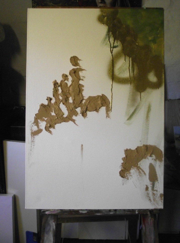
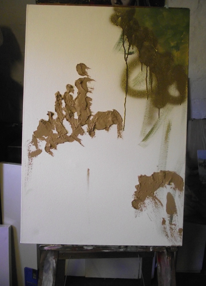
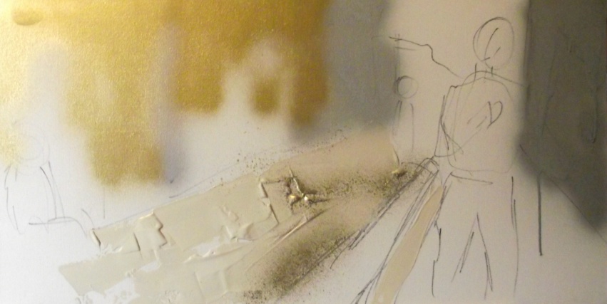
I’m usually quite organized, not like the stereotypical ‘last-minute’ kind of artiste.
However, on the 16th April 2013, I had a hunch to go and ‘check’ the due date for a competition I wanted to enter. I thought it was due on the 30th April but to my surprise, it was due the very next day — on the 17th April.
Aaaaah!
What To Do!
I had already bought the canvas, got the prelim sketch idea. Heck, I’d even thought out the description and had the perfect title!
I had but one choice. Do or die!
I locked myself up in the studio that afternoon and didn’t emerge until way after 9:00pm.
Here’s the photographic process:
And then I put the final ‘blue wash’ on…
Acrylic and Mixed Media on Boxed Canvas 15″ x 30″ x 1.5″ Prints available (click on picture)
Never Say Never!
I had done it! The next day I submitted all the info and gave myself a pat on the back.
It just shows you, you can achieve anything you set your mind to! As long as you have the will, the drive and the hootspa.
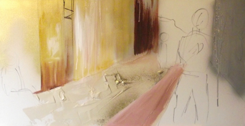
The Story Behind the Painting
This scene is taken in Loop Street, Cape Town, looking towards Table Mountain (a little bit of the mountain can be seen in the background).
The painting tells a story about the grey area of our (South Africa’s) rainbow nation.
Here we have a simple street scene but hidden within the paint is a history of greed, opportunity and division.
I have used gold and silver spray paint as the base coat of the buildings (the connotation behind the colour gold is that of wealth and prosperity) this depicts South Africa’s mineral wealth — the foundation that built the nation. However, the buildings are now covered in the grime and dirt of time.
I have two main characters in the scene. One is a street person, sitting on top of a wooden crate. His clothes are baggy and don’t fit him properly. He is staring at the young black student on his iPhone.
This young man, the second character, represents the opportunity that the black youth have today as opposed to what might have been under the Apartheid regime. He is wearing the latest fashion and seems to want for little. He is not even conscious of the man sitting on the crate. He is too wrapped up in social networking.
The man on the crate has not had the same chance in life. He is the same age but his story is one of poverty and misfortune. He is not yet experiencing the new rainbow nation of opportunity.
He is one of the many South African’s who do not benefit from the new system. Both these men are the same age yet their lives tell two completely different stories.
South Africa is a growing third world nation but it still has to iron out a lot of socio-economic problems. This painting depicts the divide in the culture that exists today.
Yet there is hope and to denote this I have given the painting a blue wash. The esoteric meaning behind the colour blue is that of youth, spirituality, truth and peace. Which is what I wish for this nation. To truly become the rainbow.
“Life is the power that’s greater than I can ever comprehend. The way life runs through everything, even the tiniest elements of nature – that makes me humble.” — Michael J. Fox
Handel With Care
No, the sub-heading is not a typo. I decided, this week, to paint to the music of classical composer, Handel. I’m not too familiar with his work or his life story but just decided on a whim that he was the one to explore this week.
I did have a slightly pre-conceived idea that I wanted to paint 2 separate landscape paintings but how these landscapes turned out was beyond my reckoning. I seem to have stumbled onto a very elemental theme with these 2 pictures.
Earth, Fire, Water and Air
“The air we breathe, the water we drink, and the land we inhabit are not only critical elements in the quality of life we enjoy – they are a reflection of the majesty of our Creator.” — Rick Perry
I used a lot of mixed-media — such as bits of the Giant Redwood bark that I had picked up in Tokai forest to metallic strips of foil that give this painting a unique ‘elemental’ feel.
I started off listening to his ‘Water Music Suite’ which I think lent to the overall theme (there is an aquatic feel in the first painting in the blue ‘lake’ and in the second painting where it looks like there’s a waterfall toppling into the earth’s core). However, as soon as I stepped back and viewed what had come out, I saw all four elements immediately.
The final touches of this painting were the cloud high-lights which gives a peaceful calmness to the painting. The hand in the clouds (in the first painting) was not intentional, it just kind of popped out as I was working on the sky.
So what interested me about these pieces was the running elements theme.
Why are these 4 things so important to us?
What do they represent for us?
How do we embrace them?
Getting Into Your Element
Most of us are living in the rat race, going from one building to another via a freeway of hustle and bustle. Then we are stuck to electronic devices pretty much most of the day having little or not time whatsoever to embrace the sheer splendour of the great outdoors.
What is missing from a lot of our lives is that raw connection to nature.
Wouldn’t it feel grand to…
get buffeted about by a strong wind, swirling around our body as we stand with no resistance and let it tickle our skin and gently blow into our ears.
make a bonfire — pile up the wood, strike that match and be mesmerized by the eternal grace of the flickering flames as they lull us into a state of hypnotic awe.
skinny dip in the buoyant bliss of deep blue waters — wading, swimming, floating, bobbing about in the supportive delights of this glorious element.
stand with our feet growing roots into the soil as we feel the connection to our beautiful planet and all the life she supports.
let go and let the awesome symphony of nature penetrate every crack or opening of your being. Let your soul soak up the splendour of mother nature and revel with appreciation for our beloved Gaia.
Can You Handel a Bit More?
“And the truth must finally lie in that which every oppressed individual feels within himself but hasn’t the courage to express” ―Wilhelm Reich
A fellow creative and confidante was the first to see the pictures a day after I had painted them. He told me straight off the cuff that he was no fan of Handel but when he saw the paintings, he bought both immediately (thank you, because I know you’re reading this!:D).
He said that, in his opinion, the paintings represented the truth behind his understanding of the origin of the music. He went on to divulge the most remarkable story behind Handel — the very reason he didn’t care for him.
It went something like this (the regurgitated succinct edition):
His music was ‘tailored’ for British aristocracy and therefore very ‘stiff upper lip, old chap’. No passion allowed, no blatant display of emotion. And all this paved the way for the onset of a new rigid era.
So, on that note, my friend and I took a deeper look into the grandiose tale of this composers life…
Georg Friedrich Handel (23 February 1685 – 14 April 1759) supplied music mainly for the English nobility which influenced his style to be more aligned with religious and social ethics.
Handel’s music was almost opposite to the music of Bach (they were around at the same time). Handel was a conformist which was deemed favourable at that specific time because England had descended into a frivolous decadence.
He supplied music with structure and conformity, reintroducing social etiquette. Glorification and the fear of God was what his music aimed at on a surface level.
His pious music injected a very tightly bound corset of primness, formality and ceremoniousness into the English society. The aristocracy welcomed this due to the growing debaucherous behaviour in British society.
The direct result of that was Victorianism.
Fake, Plastic Tunes
Now, it’s interesting to take note that people who hide under the cloak of righteousness are usually hiding something of this nature in themselves. Handel seems to have forged a pious world where his music perhaps tamed his own passions, his own story.
It’s interesting to also note that the structure of Baroque music was mostly stringent, however, bubbling underneath this composer was a burning passion — a passion that was never revealed as his private life was extremely hush-hush.
Another interesting observation is that Baroque music has also been known to connect the left and right hemisphere of the brain.
To read more about and to listen to Handel, click HERE.
The Extracted Essence
“It is the supreme art of the teacher to awaken joy in creative expression and knowledge.” — Albert Einstein
Both these paintings (above) show a remarkable resemblance pertaining to this bit of rigid but saucy history.
There seems to be a very ‘fake’ landscape painted on top of a what feels like a bubbling inferno (Handel’s passion?). Could this represent the suppressed passion for life that was stifled into forced subjugation — pomp and ceremony as opposed to naked truth?
I hope that this painting is an opening for the observer to see that all forms of artistry can reveal the innate truth if one is persistent enough to dig deep. There could be contained emotions lurking beneath even the most austere of displays. So what is the message here?
Don’t judge a book by its cover?
Or, perhaps, feel free to express who you truly are — it’ll save you a lot of time, hassle and stress.
On that note…here is your free poster/quotation of the week:
To download, click on the picture and then ‘right-click’ and ‘save image as’ to your computer. I don’t mind if you share this on your social networks or print it out for use around the home or office. Please can you leave the copyright notice as is, thanks.
If you would like to purchase a full-sized poster of the above quote, please CLICK HERE.
With Thanksgiving just around the corner, I was thinking about how all global citizens can catch a ride on this American holiday wave.
Gratitude is something we should express every day, not just on one particular day — obviously. However, having one ‘big’ day to truly express your thanks is not a bad thing.
Taking Leaves Out of American Books
So, why not mark off Thanksgiving Day as a special day for you too — no matter where you are in the world — to give thanks for all that you have. If you already make this part of your daily routine, my hat is lifted to you.
If it is something you just haven’t got around to thinking about yet, or, you have given it some thought but somehow that chemical reaction in your brain runs out of electricity as it is passed out through your ear.
In other words, you know you have mounds of things to be grateful for but you haven’t the staying power to run through the list every morning.
Making Your Own Gratitude Board in Seconds!
I have the solution! It’s called a gratitude board and it goes straight onto your fridge — the one place you are guaranteed to look at least once day!
You can make it out of cardboard, you can print it from your computer, you can make your own at Zazzle or you can buy it ready-made HERE.
However you decide to go about making this board, I suggest you set a goal to have it up and running by a certain date and hold yourself accountable. Better yet, pair up with a friend and do it together — that way you can hold each other accountable to get it done!
Suggestions and Tips to Get the Ball Rolling
These boards make great gifts too, especially if you are looking for a meaningful token for that certain someone who needs a little nudge in the right direction.
“When children are immersed in a creative task, the underlying lesson sticks like glue.”
You can also present them to your guests as a parting novelty at Thanksgiving dinner — a heart-felt gesture like that is sure to go down a treat! Or, if you are not hosting this special occasions yourself, why not give one to your whomever happens to be your gracious host at Thanksgiving lunch/dinner. Heck, they even make the perfect birthday or Christmas gift!
If you don’t feel like getting the magazines, photo’s, glue and cardboard out to make your own board from scratch, you can make a gratitude dry-erase board on Zazzle and customize it to your heart’s content — CLICK HERE (they start at $16.95). You can dress them up with your own pictures or photo’s of loved ones that you are grateful for — go mad!
Get the Kids On-Board the Gratitude Express!
You can even get your children or grandchildren involved with this project — it will be a valuable lesson for them to see just how much they also have in their lives to be thankful for. When children are immersed in a creative task, the underlying lesson sticks like glue.
Just remember to leave some room on the board for expansion. This is something that you are going to have to get used to along your path of gratitude because the more you give thanks for what you have, the more you will have to be thankful for.
If you want to recap on my last article about beginning this Beatles project, please CLICK HERE.
If you want to recap on the whole ROCK ART series BEGIN HERE
Let’s get on with the big reveal…
Whimsical, Colourful, Bright and Vibrant
The title just encapsulates the outcome of this project. It is just dripping with juicy hues, abstract sensations and psychedelic fantasy. But what would you expect from a painting inspired purely by listening to the Beatles — non-stop?
I really felt quite taken back to my youth with this one (no, not quite to the swinging ’60’s — I’m a 70’s baby). There was just so much reminiscence going on with this painting that a bit of child-like play surfaced in the making of this bold artwork.
Compared to the Last
When I put the Radiohead painting up next to this one, I really get a sense of what I’m trying to achieve with this Rock Art project. They couldn’t be more different!
I am going to have a pictorial comparison at the end of this blog for all you curious types. Please feel free to share your views.
Without Much Ado…
Here is the final product:
Here is that comparison between the Radiohead painting and The Beatles one:
As you can well see, the difference is quite apparent. So there really is something in this whole experiment with painting to different types of music. My curiosity is peaked and I am now really looking forward to doing the rest of this series.
Because Muse has just released their 6th album (2nd law), they are going to be next in line — can’t wait to see what cosmic waves are going to come out of my paint pots this time.
The Title — Help!
Before I sign off, I haven’t come up with a title for this yet. I was wondering if perhaps you could contribute any suggestions you may have that would befit this painting — the title needs to sum it all up.
Please leave your suggestions in the comment section below. Any feedback, critique or just general banter are welcome!
UPDATE: The title is ‘Metamorphic Dilatation’ (the process of changing and expanding)
Albums that I listened to in the Making of This:
Rubber Soul
Magical Mystery Tour
Abbey Road
Sgt. Pepper
Help!
Revolver
My husband told me that it’s John’s birthday soon (9 October)…so,
‘Happy Birthday, John’ — missed but never forgotten, your music lives on in all of us!
Well, this is just another teaser pictorial blog because the painting isn’t quite finished yet. However, the groundwork has been laid and we are good to go in the colorizing department. This painting is done a bit arse about face (an idiom for arranging the opposite way to the way it should be) but that is typical of someone who has their head stuck in alternate realities.
I have inked out the content and now I’m going to be adding the delectable and bright colors that are just waiting to burst forth onto the canvas. It’s going to be a bit like a coloring-in book, I guess. How exciting and unprecedented this Rock Art series is turning out to be — such toe-tingling excitement!
Painting No. 2 — Let Me Present….
I have decided it is the turn of The Beatles to rock ‘n roll their way onto my second canvas in this series. As I’m sure you’ll notice, the effect is rather different from the Radiohead painting. Well, it should be!
They’re both great bands but worlds apart. I really got a feeling of animated abstract fun and foolishness when I went into ‘Beatles’ mode. It brought back a lot of childhood memories and whimsical, magical (mystery tours?), experimental modes.
A Girl with a Plan!
This time I was savvy and started writing out all the emotions that were coming up as I was setting out the drawing (I squiggled them down on the side of the canvas — pure genius even if it does look a bit untidy).
Here are a few keywords I wrote down. Yes, some are rather strange, I admit — but this is what came up for me:
Fun
Candid
Innovative
Serious
Rigid (?)
Abstract
Exciting
Mentally Delicious
I like the last one, I think that sums up The Beatles quite well…maybe not mental, but certainly aurally delicious.
I am not revealing the picture as a whole but have cut it up into segments to add to the intrigue. Here are some sneak peeks of the painting :
You can see it in its entirety when it is finished. If you think it looks busy now, wait until the hue shows its face!
I hope to have the full color version for you within the next 2 weeks, so do tune in to the Tuesday Art/Creativity blog here by hitting that ‘follow this blog’ button in the left-hand sidebar of the homepage or at the bottom of the page (yeah, that wafty ‘follow’ button-thingy that should be following your every move).
For All You Shy Little Sausages
Oh, and one last thing…so many people write to me privately and tell me about the creative projects that they have undertaken. I love to hear about your experiments but please share them with everyone! It would be great if you could tell us what you are getting up to in the studio or what you have done in the past that’s new and innovative — don’t be shy, we’re all eager to hear about your creations. Leave a comment… 😀
As promised in last weeks blog, I will reveal today the albums I listened to during the creation of ‘Escapism’. If you have been following this Rock Art Series blog then great, if not you can recap by startinghere.
“As we were walking and talking about this I caught a glimpse of my companions face under the hood — yes ladies and gentlemen, it was a very young and blonde Thom Yorke …”
In no particular order, they were:
Some of my favourite songs at the moment are ‘Lotus Flower’ (fan-blooming-tastic video!), ’15 Steps’, ‘Little by Little’ and ‘Bodysnatchers’. I have also had the great honour of seeing them live in London on their ‘Hail to the Thief’ album tour in 2003 — what an experience!
I unfortunately did not have enough time to listen to ALL their albums (as I would have so loved to have done), so what I listened to in the above track-list must have been relevant in some way to the picture. I just went with the flow and stopped when I felt it necessary. I like to think that everything has a quantum reason for taking place, which brings me to my dream…
Bloody Weird or Maybe Not!
I had a dream a few days ago about the painting.
I was walking with a hooded figure who was discussing the painting and linking it to the root chakra (what I like to call the poop chakra ’cause you usually associate that one with letting go of the crap). For those of you who don’t know, the root chakra is associated with your anus.
‘Escapism’ by Cherie Roe Dirksen (below)
As we were walking and talking about this I caught a glimpse of my companions face under the hood — yes ladies and gentlemen, it was a very young and blonde Thom Yorke (the ‘Pablo Honey’ days look).
We then stopped at the painting and he said that it had a coded message in it, one that I subconsciously painted into the picture and it had to do with letting go. Particularly for parents of daughters who were finding it hard to ‘let them go’.
Interesting…it’s like one of those ridiculous stories from Ripley’s ‘believe it or not’…lol. Or maybe not. I have witnessed and experienced enough hoodoo lately to make this just a drop in my ocean of the weird and inexplicable.
So if the dream is true — great! If not, well…‘nice dream’...he he.
Emotions While Painting
Okay, I jotted down a few things that were coming up for me or going through my mind as I was painting. I’m going to list it in point-form so you can better understand the end result of the painting:
Other worldly/out of this world
Expressing and experiencing emotional pain and anguish
Also experiencing pleasure
Loss and frustration
Chaotic sound that blends into perfect harmony/order
Orgasmic sounds in the mix and off-beats
Being unconventional/out-of-the-box living
Being different and yet fitting in anyway
A celebration of being different
I absolutely love their production and orchestration of complete chaos and bizarre beats that amalgamate to produce the tastiest, funkiest songs I have had the pleasure to bathe my ears in.
To end of with: My husband and I (yes, I sound like the queen) went to see a horror movie over the weekend and the ticket man said ‘Why are you going to see such a creepy movie?’, to which I solemnly replied, ‘We are creepy people’.
I am proud to be different and, thanks to Radiohead, we can proudly display the creep within.
I gave myself permission for complete artistic freedom, pleasing nobody but myself in the process. So, in short, I just let loose on the canvas and did what I felt compelled to do.
I am happy to show you the first painting of this 10 part series. I have called it‘Escapism’.
Available as prints — click on the picture.
Here are some close-ups and segments of the painting:
Thanks to Radiohead for the out-of-this-world inspiration!
I am going to run through my emotions and what inspired me to paint what I did in next Tuesdays blog as well as reveal what albums I was listening to.
For now, I would love to hear your feedback and comments about what you see here.
Ok, I know, I was supposed to have at least one finished by today — it just didn’t happen.
However, I have made a definite start and to prove it I have decided to give my viewers a sneak peek at the painting. Here are the first 2 steps I took photo’s of whilst painting (first stage painted whilst listening to ‘We suck your blood’…hmmmmm — can you tell?):
I have cut the rest of the painting up into segments, just to add to the enigma…here are some of the ‘parts’ of the painting:
It’s going to be interesting to see what impression you conjure up in your imagination as opposed to how the whole thing looks at the end (to be unveiled in next Tuesdays blog, God willing).
Let me know what your thoughts are:
Are these the colours you expected?
Are the textures, subject matter and vibes what you imagined?
My husband said that this is not at all what he gets when he listens to Radiohead but that’s the point! Everyone will bring their own interpretation to a piece of music — perspective is a grand thing. 🙂
I launched my new idea for an art collection last week, please read it here to recap.
The bands and musicians that I am going to explore auditorily and interpret visually on canvas are (in order of my being introduced to their music):
David Bowie
Queen
Pink Floyd
The Beatles
Skunk Anansie
Radiohead
Rufus Wainwright
Templeton
Muse
Jeff Buckley
Ha! And there you have it…I will be embarking on the first painting of this series this week and, with a bit of cosmic luck, may have something to blog about next week.
Proceedings…
I am not going to pressure myself to paint in this order — I am basically going to work it on my mood and who I feel like listening to at that given time. Make sense? No? Well, that’s fine!
Wish me luck as I have no idea how this is going to turn out 🙂
Yeah, the global energy of late has been intense. Making us all bunker down for some quiet time, and if not, forcing you to cease and desist.
Have you been lacking inspiration, creativity or get up and go? Well, I have.
These last few weeks since I returned from Egypt have been damn right frustrating. I’ve lost my pluck, mojo and anything else you want to call it.
I’ve picked up the paintbrushes and seem to be trying to repeat old patterns in creativity that just don’t work for me anymore.
“It could be realism, abstract, impressionism, crapism or bullshitism…who knows? We’ll just have to wait and see.”
But this weekend I had a revelation…
Who The Hell Am I?
Yes, that old humdinger. What can I truly offer the world that is unique and not only that, stay completely in alignment with who I am?
Not easy and a question I am not alone in having to come up with an answer to — this seems to be the common thread or million dollar question among most people this year, if not this lifetime!
I Am…
I sat down to have some quiet time to reflect and saw a storyboard of everything I have done since I left school. I know that I am intrinsically an artist, musician and a writer and I have tried to merge the 3 in this website but something still hasn’t clicked into place. In a nutshell, it went like this:
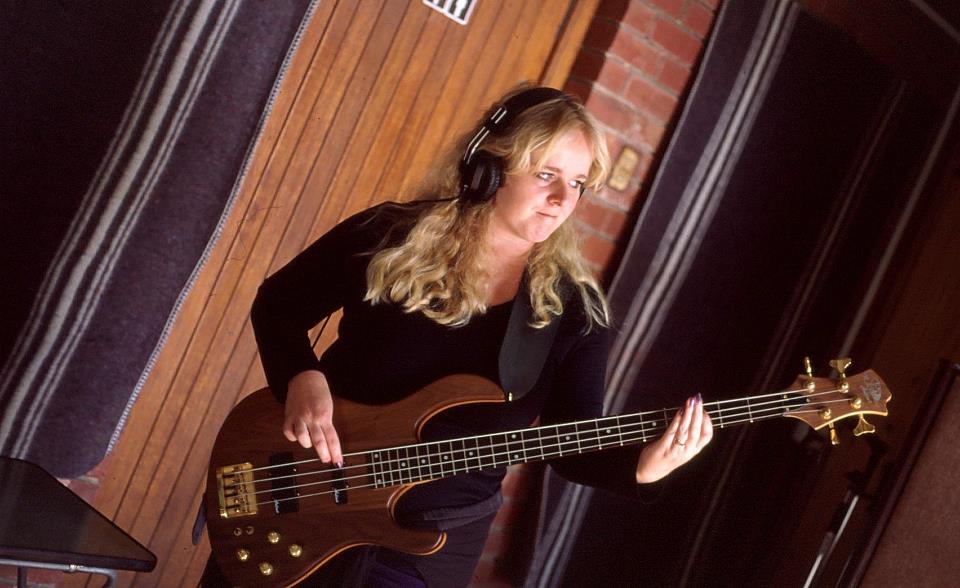
Above (Photo of our band The Bends taken in 2001)
The Younger Years — Left school and played bass in 2 rock bands. Last band (The Bends — you guessed it, we were all Radiohead fans…yeah yeah) recorded 2 albums and got some radio play. After the music scene cooled off and my weariness set in I up and left for the UK. Photo (right) — in Paris Studio recording our 2nd album.
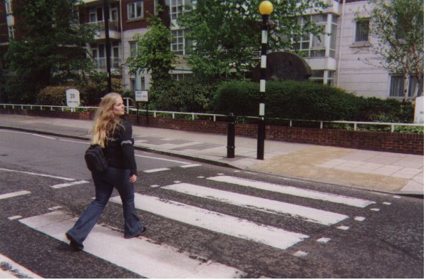
Travel Bug — In the UK I started painting again. Got back home, 3 years later, and started painting full-time.
Above — In the UK, at the famous ‘Abbey Road’ crossing, London
Divine Revelations and Ants in my Pants — Started feeling ‘pushed’ to write my book ‘Divine You’ in 2010 and did so, focusing all my energy and attention into getting it published and promoting and blogging, etc.
Footnote — Here I am, having come full circle with all 3 of my major interests but I feel like I need to break free from the confines of every single one of them. I need to fuse them into a trinity of talents that will truly showcase the uniqueness of my being.
New Realizations:
I am a rock chick, a philosopher, a creative, a free spirit, a wanderer, a listener, an adventurer, a seeker, a trailblazer…so what am I trailblazing?
” I am more than the ceiling limit I have built over my head.”
I feel like at the moment I am trying to conform to the standards of any other self-empowerment writer (who just happens to paint and compose on the side). No, this is not working for me. I am more than the ceiling limit I have built over my head.
Major Refurbishing
I am going to be blowing through the ceiling.
My first adventure, that incorporates all 3 of my pursuits, will be to do a series of 10 paintings to my favourite bands or musicians from the dawn of my time here on Earth.
A little background: I love to turn on the stereo in the morning and blast out my favourite music much to my husbands annoyance. It just happens to usually be quite loud and obnoxious music for this time of the morning. However the upside is that this ensures that the car gets washed, or that the lawn is mown (husband seeking refuge outside of the domain).
“I want to be activated into action first thing in the morning — and this plus a cup of coffee seems to do the trick.”
There is nothing like a bit of Airbag by Radiohead to get the blood flowing after a long nights sleep or head-banging your way to the bathroom to get cleaned up to Hysteria by Muse. Who can’t be put into a good mood when you are listening to Queen’s I Want to Break Free? Or even better, David Bowie belting out ‘Drive in Saturday’?
Yes, I know, I am a bit odd. This is probably not the best morning music soiree (I am told this is strictly night-time music) but I simply can’t wait for night-time to arrive, I want to be activated into action first thing in the morning — and this plus a cup of coffee seems to do the trick.
So Where is This Heading? Get On With It, Girl!
Okay, okay…I love rock. Yes, oh yes. So I have selected 10 bands to do 10 painting to. I want to see what comes out whilst listening to their music. I hope this experiment will be a visual feast and have no preconceived ideas of how any of it will turn out. All I can guarantee is that I am going to have fun in the process and do whatever comes to me in the moment that I set aside to paint.
It could be realism, abstract, impressionism, crapism or bullshitism…who knows? We’ll just have to wait and see.
I will be blogging (obviously) about each artwork and the process (so watch out for Tuesdays art blog). And will reveal the top 10 bands/musicians that have been the greatest influence in my life in next Tuesdays blog.
So in the words of the famous Monty Python…”and now for something completely different”. Bring it on!
Note to self: Need to add new word invented in this blog to Wikipedia — ‘crapism’. Needs no definition either, self-explanatory. Bullshitism seems to be a valid word because my spell check didn’t pick it up.
Share Your Insights:
What are you struggling with?
Do you have yourself all sussed out or are you still in flux about who you really are?
Do you think it is important to align yourself with your core essence or do you think that is just a bunch of crap?
Hail to one of the most amazing albums my ears have had the pleasure to experience!
“He is really pushing the boundaries of auditory excellence.”
If you haven’t heard it yet, I strongly suggest you visit Templeton’s site (http://templetonuniverse.com/news.cfm) and have a snoop around, I believe he is offering some FREE MP3 DOWNLOADS over there — all you have to do is become a member (just click on ‘not a member?’ on the top right hand corner of the site to sign up — quick, easy and free).
Infinite Inspiration to Work From
I had so much to draw from whilst designing this album art — from Templeton’s cosmic new sounds to the history and messages behind his music. This was actually easy to do because I had so much to work with. He is really pushing the boundaries of auditory excellence.
Front Cover (above)
This is the third album cover I have done for Templeton and this is his fourth album.
I am pleased to showcase all the artwork for this CD, from inlays to back cover, that was the brainchild of Templeton and myself.
Here it goes:
The Insert
The Inlay
The CD
The Back Cover
If you want to read about the inspiration behind the music and the artwork, Templeton has a blog out that takes you through his whole creative process:


 Needless to say I was livid and despondent. I don’t wish any animal harm, so I would never hurt them but I couldnt see a way out of this gigantic problem. Someone suggested I give up my dream of an edible garden. No way, Jose. I’m probably a sucker for punishment but I can’t do that either.


 Feeling a Little Uptight Lately?


 Bloody Hell!


 Georg Friedrich Handel (23 February 1685 – 14 April 1759) supplied music mainly for the English nobility which influenced his style to be more aligned with religious and social ethics.


 Yes, I know I have kept you waiting for the second piece of this series but wait no longer!